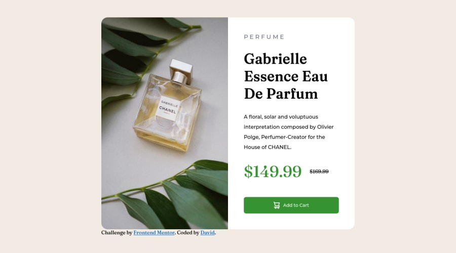
Not Found
Not Found
Not Found
Not Found
Not Found
Not Found
Not Found
Not Found
Not Found
Not Found
Not Found
Not Found
Not Found
Not Found
Not Found
Not Found
Not Found
Not Found
Not Found
Not Found

Submitted

Product Preview Card

David Lamβ€’ 120

@Dvid-code

Desktop design screenshot for the Product preview card component coding challenge

This is a solution for...

  • HTML
  • CSS
1newbie
View challenge

Design comparison


SolutionDesign

Solution retrospective


Hello, who ever is reading this.

  1. In the HTML did I use too many ID's or were some parts not necessary to use an ID? In the CSS I feel like I used too many ID's and it looked longer than it needed it to be.
  2. For the button is there a better way of making it so that it stretches horizontally to the margins? I used specific numbers for both layouts. When I made it with padding I put 90px for the horizontal and I would add a 1 each time until it would touch the margin without the text inside creating a second line.
  3. A problem I had with the text inside the button was that I wanted to make the font size larger but it kept creating a second line moving the last word to the bottom. Is there a way to make the content box larger horizontally for the words or is that non-adjustable? When I say content box I'm referring to the blue box for content, padding, border, margin in case I'm using the wrong words.

Community feedback

@MelvinAguilar

Posted

Hello there πŸ‘‹. Good job on completing the challenge !

I have some feedback for you if you want to improve your code.

  • Questions:

    1. For specificity reasons you should work with classes instead of ids because they are more reusable. You can use ids to work with JavaScript, but you should use classes to style your elements. You can read more about this here πŸ“˜.

    2. Yes, you can use the CSS property width: 100% to make the button stretch horizontally to the margins. This will ensure that the button always takes up the full width of its parent container, regardless of how wide it is.

    3. You can try decreasing the padding of the button and increasing the font size slightly to make it fit. the "content box" cannot be adjusted, as it adapts to the width, margin, and padding, and because of the large padding of the button, it doesn't have enough space for all the text to fit on a single line.

HTML πŸ“„:

  • Use the <main> tag to wrap all the main content of the page instead of the <div> tag. With this semantic element you can improve the accessibility of your page.
  • Use the <footer> tag to wrap the footer of the page instead of the <div class="attribution">. The <footer> element contains information about the author of the page, the copyright, and other legal information.
  • You could use the <del> tag to indicate the price that was before the discount. Additionally, you can use a sr-only class to describe the discount. This will help screen reader users to understand that the price was discounted.

    Example: <del><span class="sr-only">Old price: </span>$169.99</del>

  • The alt attribute is used to provide a text description of the image which is useful for screen reader users, assistive technology users, and search engine optimization. Add the alt attribute to the <img> tag of the product.

CSS 🎨:

  • Instead of using pixels in font-size, use relative units like em or rem. The font-size in absolute units like pixels does not scale with the user's browser settings. This can cause accessibility issues for users who have set their browser to use a larger font size. You can read more about this here πŸ“˜.

I hope you find it useful! πŸ˜„ Above all, the solution you submitted is great!

Happy coding!

Marked as helpful

0

David Lamβ€’ 120

@Dvid-code

Posted

@MelvinAguilar Hi Melvin. Thanks for the reply. In the design comparison at the top do you know why its displaying the mobile view instead of the desktop view?

0

@MelvinAguilar

Posted

@Denounce7 The mobile view is being displayed because the you are using a media query with a breakpoint that is too big @media (max-width: 1440px) The screenshot was taken as if it were being viewed on a 1440px wide computer, so your media query is still valid.

Marked as helpful

0

Please log in to post a comment

Log in with GitHub
Discord logo

Join our Discord community

Join thousands of Frontend Mentor community members taking the challenges, sharing resources, helping each other, and chatting about all things front-end!

Join our Discord