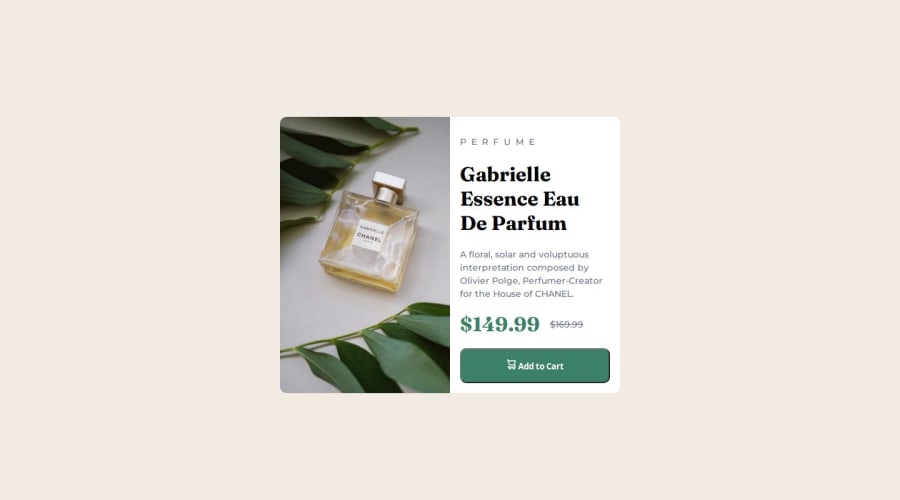
Not Found
Not Found
Not Found
Not Found
Not Found
Not Found
Not Found
Not Found
Not Found
Not Found
Not Found
Not Found
Not Found
Not Found
Not Found
Not Found
Not Found
Not Found
Not Found
Not Found

Submitted

Product preview card component

thamu-acn• 200

@thamu-acn

Desktop design screenshot for the Product preview card component coding challenge

This is a solution for...

  • HTML
  • CSS
1newbie
View challenge

Design comparison


SolutionDesign

Solution retrospective


What are you most proud of, and what would you do differently next time?

I was able to load different image files based on device size. I want to explore more image and picture related properties. I was also able to mix flexbox and grid layouts.

What challenges did you encounter, and how did you overcome them?

Switch from one column for mobile to two columns on desktops. I set grid display on the card wrapper based on media query.

Community feedback

P
Steven Stroud• 4,100

@Stroudy

Posted

Hey, Great solution! I ran Google Lighthouse and you scored 100 in all four categories, A Few things I noticed,

  • Using a naming convention like BEM, Using proper naming will prepare you for the changes in design of the website.
  • Setting a height and width attribute to your <img> will increase performance to reduce layout shifts and improve CLS, It reserves the space on the page for the image,

I'm actively looking for something I could give my limited advice on but you smashed it, I hope you found some of this information helpful, I look forward to seeing some more from you, Happy coding! 💻✅✅✅

Marked as helpful

1

thamu-acn• 200

@thamu-acn

Posted

@Stroudy Thanks for the feedback.

I have managed to use BEM in my project after following the helpful link you shared.

Do you mind sharing some code snippets or your solution for this particular challenge to show me how I can set width and height of the img instead of the 'max-inline-size' and 'height: 100%' that I used to make it flexible on both mobile and desktop.

1
P
Steven Stroud• 4,100

@Stroudy

Posted

@thamu-acn, Hey BEM is super useful, I am still getting my head around it and would rather develop good habits early rather than later. Yeah, no problem happy to help, So you set the height and width to the <img> in HTML, Doing this provides a fallback size for browsers while the image is loading, reducing layout shifts while loading.

<img src="images/image-product-mobile.jpg" alt="Gabrielle Essence fragrance." width="686" height="480" />
  • Image dimension, I got this information from the image in the folder using normal file explorer, Right click, Properties, Details.

I hope this explains it, keep asking questions and keep coding!

0

Please log in to post a comment

Log in with GitHub
Discord logo

Join our Discord community

Join thousands of Frontend Mentor community members taking the challenges, sharing resources, helping each other, and chatting about all things front-end!

Join our Discord