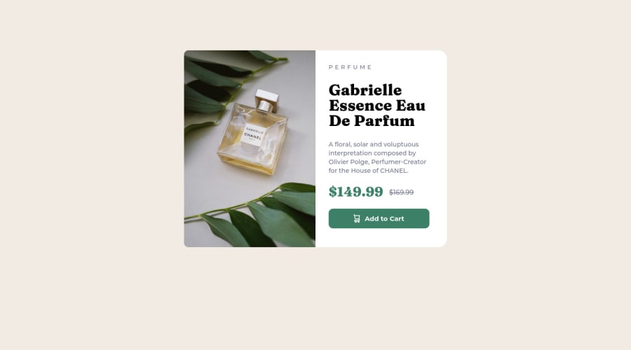
Not Found
Not Found
Not Found
Not Found
Not Found
Not Found
Not Found
Not Found
Not Found
Not Found
Not Found
Not Found
Not Found
Not Found
Not Found
Not Found
Not Found
Not Found
Not Found
Not Found

Submitted

Product Preview Card Component

Anita uka 80

@neetauka

Desktop design screenshot for the Product preview card component coding challenge

This is a solution for...

  • HTML
  • CSS
1newbie
View challenge

Design comparison


SolutionDesign

Solution retrospective


** I found it difficult to perfectly center a div. I was able to do it after many trials and erros ** I found it difficult to write media queries. Moving from desktop to mobile and vice versa **I found it difficult to switch between images for different screen sizes

Community feedback

Lucas 👾 104,420

@correlucas

Posted

👾Hello Anita uka, congratulations for your first solution! 👋 Welcome to the Frontend Mentor Coding Community!

Great start and great first solution! You’ve done really good work here putting everything together, I’ve some suggestions you can consider applying to your code:

A shortcut to deal with the multiple images in this challenge is by using the <picture> tag instead of importing this as an <img> or using a div with background-image. Use this tag to make the image change between mobile and desktop is to use <picture> instead of <img> wrapped in a div. Look that for SEO and search engine reasons isn’t a better practice import this product image with CSS since this will make harder to the image be found. You can manage both images inside the <picture> tag and use the html to code to set when the images should change setting the device max-width depending of the device (phone / computer) Here’s a guide about how to use picture: https://www.w3schools.com/tags/tag_picture.asp

I saw that you've used some CSS reset and I suggest you to use this modern CSS reset that is really complete and make sure you'll get ride from a lot of default css that gives you problem. https://piccalil.li/blog/a-modern-css-reset/

✌️ I hope this helps you and happy coding!

Marked as helpful

0

Anita uka 80

@neetauka

Posted

@correlucas thank you so much sir. It was really helpful

0
Md5 dalton 1,430

@md5dalton

Posted

Hello Anita... Welcome to Front-end Mentor. Good Work on your solution.

You can center the preview card by using flex box. Here's how you can do it:

body {
    min-height: 100vh;
    display: flex;
    align-items: center;
    justify-content: center;
}

Then remove the margins on main.

You can use the picture HTML element to switch between the images depending on screen size:

<picture>
    <source srcset="/images/image-product-desktop.jpg" media="(min-width: 576px)" />
    <img src="/images/image-product-mobile.jpg" alt="product image" />
</picture>

I've also noticed that you downloaded the fonts to your design's folder, that's not necessary since google cdn will be much faster, instead use link in your HTML:

<head>
   <link rel="preconnect" href="https://fonts.googleapis.com">
   <link rel="preconnect" href="https://fonts.gstatic.com" crossorigin>
   <link href="https://fonts.googleapis.com/css2?family=Fraunces:wght@700&family=Montserrat:wght@500;700&display=swap" rel="stylesheet">
</head>

Then in your styles use the fonts like this:

body {
    font-family: "Montserrat", sans-serif;
}

h1 {
    font-family: "Fraunces", serif;
}

I've also completed this challenge recently, so I'll leave the link here if you want to see my approach: Product preview card component.

I hope this helps with the issues you had. Feel free to ask if you need further explanation👌

Marked as helpful

0

Anita uka 80

@neetauka

Posted

@md5dalton thank you so much sir🥺. I encountered a bug using the html picture tag. That was why I used the img tag to switch

0
Md5 dalton 1,430

@md5dalton

Posted

@neetauka you're welcome.

If you may share the code you used, we might be able to help you identify what the issue is👌

0
Anita uka 80

@neetauka

Posted

@md5dalton the code is shared already

1
Adriano 34,170

@AdrianoEscarabote

Posted

Hi @neetauka, how are you?

Welcome to the front-end mentor community.

You did a good job on this challenge, but I have a few tips that I think you'll like:

1- Images must have alternate text click here

2- Page should contain a level-one heading, you could have changed the h2 to h1 click here to read about it

**I noticed that you centered the content with margin, you could have centered it with flex-box, for example:v

body { display: flex; align-items: center; min height: 100vh; justify-content: center; flex-direction: column; }

The rest is great! Hope it helps... 👍

Marked as helpful

0

Anita uka 80

@neetauka

Posted

@AdrianoEscarabote thank you so much sir. This was help. I also noticed my mobile version isn’t positioned well. I don’t know what could be the issue

0

Please log in to post a comment

Log in with GitHub
Discord logo

Join our Discord community

Join thousands of Frontend Mentor community members taking the challenges, sharing resources, helping each other, and chatting about all things front-end!

Join our Discord