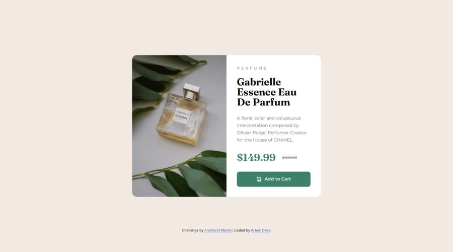
Product Preview Card Component solution using HTML/CSS (Sass)


Design comparison

Solution retrospective
This time I started with the mobile-first approach, as it was advised. This was a bit unusual for me, but I thin I got it.
I used Pixelay extension in Figma again to compare the code with the provided design.
What challenges did you encounter, and how did you overcome them?When comparing my code with the design in Pixelay extension, I still couldn't get the font exactly the same.
Sometimes I had to go against the instructions from the design, to make it look exactly as it is on design (it's usually margins and padding).
What specific areas of your project would you like help with?I'd appreciate to hear others developers' practices in implementing fonts and following design instructions.
Community feedback
- @WB52Posted 11 months ago
Your design looks close to the original, nice work...
I've noticed the design images don't always match the figma designs 100%, often spacing is different, or things are misaligned etc. Also there was one where the font had changed slightly on google fonts so the font didn't match the design exactly and threw things out . When all said and done I've realised not to worry about getting things 100% pixel perfect, close enough is good enough to build skills, which is ultimately what we are doing with these projects.
I did notice one thing that you could change on your project (if you wanted to try and keep to the original design) when it goes to mobile it keeps the border radius top left and bottom left on the image, on the mobile design the bottom left changes to top right so there's a radius on the top corners only. That said yours still looks good as it matches the desktop design by not changing...
Marked as helpful0P@Artiom-DeyevPosted 11 months ago@WB52 Thank you for mentioning about the border. This is something I missed when I was qa'ing (it's always good to have someone else to take a fresh look at your work).
1

Please log in to post a comment
Log in with GitHubJoin our Discord community
Join thousands of Frontend Mentor community members taking the challenges, sharing resources, helping each other, and chatting about all things front-end!
Join our Discord