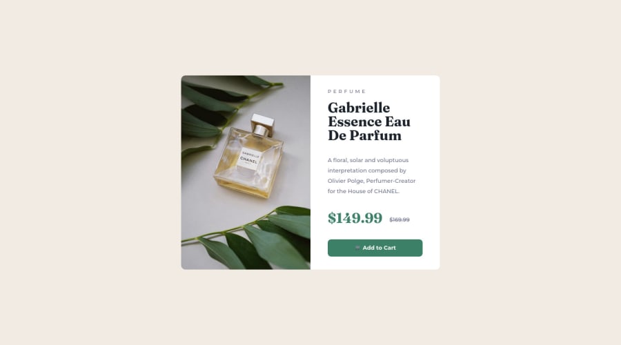
Product preview card component solution using HTML & CSS Flexbox


Design comparison

Community feedback
- @TanDevvPosted about 2 years ago
Hi, divyanshthakurx! Great work on this one! Let's talk about a few things in the accessibility report. :)
📝HTML:
- Document should have one main landmark | All page content should be contained by landmarks
After your body tag, consider adding landmarks such as, <nav>, <main> and <footer> as a parent to the corresponding content you have where it makes sense. This helps keep your HTML organized and makes it accessible for users using screen-readers, so a win-win for everybody.
(For more information on what is semantic markup, you can read this article by MDN)
- Page should contain a level-one heading
Every site must have a
h1where it may make sense, (eg: a title) to describe the main content of your page. This provides vital navigational assistance for users that use assistive systems for impairment, helping them easily find the main content they want to get to.If sometimes your page may not have something you think deems as a
h1, we can use what is called visually-hidden by hiding it from visual users but will still be called out by a screen-reader for visually impaired users.(For more information on this, you can read this article by Webaim)
- Images must have alternate text
Ensure all your
<img>elements have short, descriptive alternate text such as,<alt="drawing of a cat">as it is incredibly useful for accessibility; screen readers will read your alt description out to their users so they know what the image means while exploring your page.Alt text is also displayed on the page if the image can't be loaded for some reason: for example, network errors, content blocking or links expiring.
For other elements such as icons or images that are purely decorative that hold no meaningful content, you can give it an empty
<alt>description so screen-readers will ignore it!(For more information regarding <alt>, you can read this article also by MDN)
🎨 CSS:
-
Use
min-height: 100vhinstead ofheighton yourbody. Setting the height to 100vh may result in your content being cut off on smaller screens, such as a mobile phone in landscape orientation or possibly a screen-size below 375px width. -
I would suggest maybe increasing the width at which your
@mediabreak-point is at,375pxfor a desktop design is quite low and as such is causing horizontal scrolling for mobile/tablet until it has enough width to fully show all your content.
I hope you find this information helpful. Above all, your solution is great, well done! 😄
Marked as helpful0

Please log in to post a comment
Log in with GitHub
Join our Discord community
Join thousands of Frontend Mentor community members taking the challenges, sharing resources, helping each other, and chatting about all things front-end!
Join our Discord