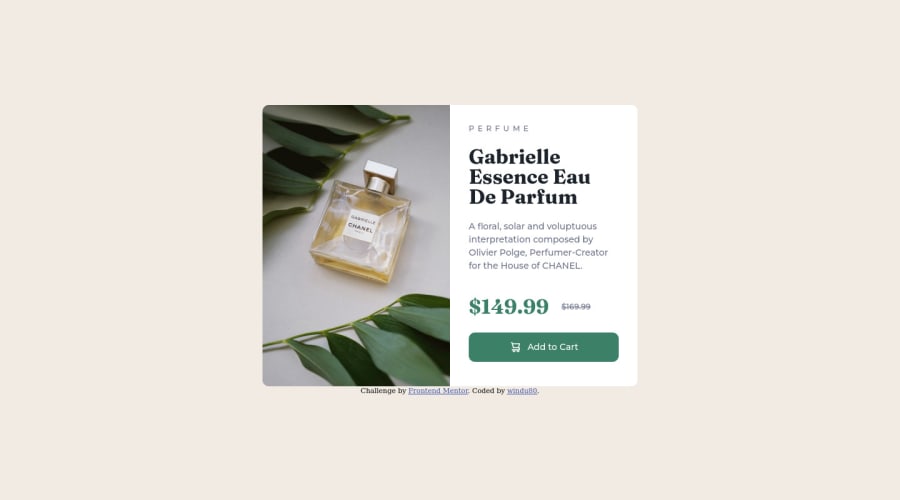
Product preview card component - solution - using HTML and CSS
Design comparison
Solution retrospective
My very first Frontend Mentor challenge.
-- desktop version only for now --
For me, the trickiest part is getting the HTML "skeleton" right. I didn't use any table tag, only a combination of different div to try to get the structure right. But I'm wondering if using a table row, with the left picture and the right product-description as two table cells would have been more efficient. Although, making all the tr and td elements tends to add a lot of (unnecessary?) code and hierarchy levels, so really not sure what's the best way to go. Thanks for helping please!
Community feedback
- @PaulawlietPosted over 2 years ago
it looks like your github pages has an error, Kindly check because I can't see your live website page
0
Please log in to post a comment
Log in with GitHubJoin our Discord community
Join thousands of Frontend Mentor community members taking the challenges, sharing resources, helping each other, and chatting about all things front-end!
Join our Discord
