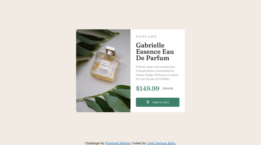
Product preview card component solution using flexbox
Design comparison
Solution retrospective
Frankly, I had some difficulty in responsive design and it took a lot of time. Why do you think I wasted so much time? Please review my code, I would appreciate if you indicate the places you think are missing or unnecessary.
Community feedback
- @DrougnovPosted over 2 years ago
Hello @cenkderman, great job.
-
The design is looking perfect on the desktop viewport. But the text-content is exceeding the container in mobile view. Avoid using height if not absolutely necessary.
-
The google font link is wrong. In the HTML change your font link to this:
<link rel="preconnect" href="https://fonts.gstatic.com" crossorigin> <link href="https://fonts.googleapis.com/css2?family=Fraunces:opsz,wght@9..144,700&family=Montserrat:wght@500;700&display=swap" rel="stylesheet">```. Or, just simply add this line at the top of your CSS : ```@import url('https://fonts.googleapis.com/css2?family=Fraunces:opsz,wght@9..144,700&family=Montserrat:wght@500;700&display=swap');```- Use a default font in the body tag. Ex: Montserrat and use the other one on the needed element. In this way, you can save some lines.
- Although you have beautifully added the images with display none and media queries, the semantic way would be using the
picturetag. Like this:
<picture><source media="(min-width: 650px)" srcset="./images/image-product-desktop.jpg"><img src="./images/image-product-mobile.jpg" alt="Gabrielle CHANEL's perfume bottle"></picture>Don't forget the alt text 😉.
You can check my solution for further information. If you have further questions, feel free to ask. Have a good day.
(edit) Having trouble formatting the comment. I hope you can still understand what I'm trying to say
Marked as helpful0 -
Please log in to post a comment
Log in with GitHubJoin our Discord community
Join thousands of Frontend Mentor community members taking the challenges, sharing resources, helping each other, and chatting about all things front-end!
Join our Discord
