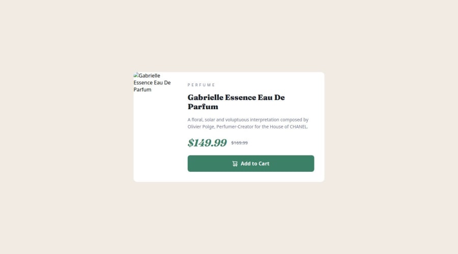
Product Preview Card Component Solution


Design comparison

Solution retrospective
Reflections
What are you most proud of?
I'm proud of how I applied responsive design principles using Flexbox and CSS Grid to ensure the component looks great on different screen sizes. I also successfully used CSS custom properties to maintain a consistent color scheme.
What would you do differently next time?
Next time, I would focus on improving accessibility by adding ARIA labels and ensuring all elements have proper semantic HTML. I’d also like to experiment more with CSS animations and transitions to enhance interactivity.
Challenges and Solutions
What challenges did you encounter?
One of the main challenges I faced was ensuring the card component maintained a clean and responsive design across different screen sizes. It was tricky to balance the layout using both Flexbox and Grid while keeping the design consistent.
How did you overcome them?
To overcome this, I used a mobile-first workflow, applying media queries for larger screens. I also utilized CSS custom properties for maintaining a uniform color scheme, which simplified design adjustments. Additionally, I tested the layout on various devices using browser dev tools to fine-tune responsiveness.
Feedback Request
What specific areas of your project would you like help with?
- Accessibility: I would appreciate feedback on how I can improve the accessibility of my project. Are there any ARIA labels or semantic improvements I could add?
- Design Consistency: I’d like to know if the design looks consistent across different screen sizes. Any suggestions on maintaining a better responsive layout are welcome.
- Code Optimization: If there are areas where my HTML or CSS could be cleaner or more efficient, I’d be happy to receive suggestions.
- Performance: Any tips on improving loading times or reducing unused styles would be helpful.
I’m open to any other constructive feedback you may have!
Please log in to post a comment
Log in with GitHubCommunity feedback
- P@LaStellaa
Hi there! Well done for putting in the work on this project, keep it up! Your HTML structure looks good. However,
- the images folder is missing from your repository and consequentially from the design. Just add it and double-check the image file path, and it'll be fixed.
- Our container is divided into 2 so I advise you to use
display: grid;and set thegrid-template-columns: repeat(2, 1fr);on large screens and adjust for small screens, this is going to make your life so much easier for this design. - I also suggest that you use em and rem units instead of pixels for
font-size,paddingandmarginas these are responsive and again will make your life easier.
Start with these implementations and see how it goes! Good luck with everything and again well done!
Marked as helpful

Join our Discord community
Join thousands of Frontend Mentor community members taking the challenges, sharing resources, helping each other, and chatting about all things front-end!
Join our Discord