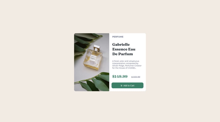
@MelvinAguilar
Posted
Hi @payalpagaria ๐, good job for completing this challenge!
Here are some suggestions you might consider:
- Try to fix the issues indicated by the report in this solution.
1.You can use <picture>
tag when you need to change the image on different viewports, using this tag will prevent the browser from loading both images, saving bandwidth. More information here
Example:
<picture>
<source media="(max-width: 460px)" srcset="./assets/images/image-product-mobile.jpg">
<img src="./assets/images/image-product-desktop.jpg" alt="Gabrielle Essence Eau De Parfum">
</picture>
2.You should have used flexbox on the .container and had "flex-direction: row;" for later, when viewing on mobile devices, using a media query, change the direction with "flex-direction: row"; and you would not occupy position: absolute. How TO - Two Column Layout
More information:
- A Complete Guide to Flexbox (CSS-Tricks)
- Flexbox - The Ultimate CSS Flex Cheatsheet (with animated diagrams!)
Grid layout:
3.You could use a CSS Reset to remove browser built-in styles and reduce browser inconsistencies
Your body's default margin causes the vertical scrollbar to appear
Popular reset style sheets:
4.Try to use more descriptive names for your classes, I suggest you learn BEM naming convention standard for CSS class names because increases the readability of front-end code, provides a modular structure, and its more easier to work with.
I hope those tips will help you.
Good Job and happy coding !
@payalpagaria
Posted
@MelvinAguilar Thank you very much for the suggestions...!!! I will surely consider it while working on the next task, Thanks for taking time to provide the resources along side..!