Design comparison
Solution retrospective
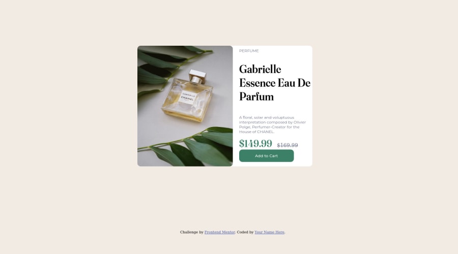
I have 2 question with this challenge:
1.) How can I insert cart logo in my add to cart div?, I tried using fontawesome but to no avail, it did not work out.
2.) How can I make round corner in the left side only of the image?.
Thank you!.
Community feedback
- @elaineleungPosted over 2 years ago
Hi Roland, well done here! I'll try to answer your questions:
-
About the icon, there actually is already an icon provided in this challenge (icon-cart.svg), and all you need to do is insert it into the HTML, like this:
<button>
    <img src="images/icon-cart.svg" alt="">
     <span class="product__cta-text / fw-bold">Add to Cart</span>
</button>
If you want to use Font Awesome, I believe you might need to set up an account with them, and then there should be a link that they provide for you to put inside the
headtag. -
To make only the left side corners of an image rounded, use
border-radius: 10px 0 0 10px. In the mobile view for the top part only, useborder-radius: 10px 10px 0 0.
Looking at your component in the inspector, I think you can try using
display:flexto position your text and image sections, because right now I see you usingfloatand that can be hard to make adjustments. You can have a look at how flexbox can be used in my solution: https://www.frontendmentor.io/solutions/card-component-using-cube-css-tNaBY0y_NxMarked as helpful0@Rjae07Posted over 2 years ago@elaineleung
Hello Maam Elaine,
Thank you for the feedback will remember this in taking my next challenge.
Thanks once again!.
1 -
- @devnngaPosted over 2 years ago
For the rounded corners, use border - right top and border - right bottom to target those specific areas.
Marked as helpful0 - @ColonelSandurzPosted over 2 years ago
Hi Roland
I am new to this site but I can at least assist I hope with question 2. Using border-radius defaults to manipulating all four corners, but you can specify a particular corner as shown below.
border-top-left-radius: 10px;
border-bottom-left-radius: 10px;
I am not sure if there is another way to do this ( I know in CSS there are many ways to do one thing) but this works fine for me.
Marked as helpful0@Rjae07Posted over 2 years ago@ColonelSandurz
Thank you for the feedback, will remember this with my next challenge.
Thank you!.
0 - @joao-juniorPosted over 2 years ago
A solução mais simples para incluir o icone dentro do botão é adicionar uma tag img dentro do button e você pode colocar o display flex no button para arrumar o posicionamento:
<button class="button"> <img src="images/icon-cart.svg"> Add to Cart </button>0
Please log in to post a comment
Log in with GitHubJoin our Discord community
Join thousands of Frontend Mentor community members taking the challenges, sharing resources, helping each other, and chatting about all things front-end!
Join our Discord
