


@elaineleung
Posted
Hi Yessika, congrats on completing your first Frontend Mentor challenge! 😊
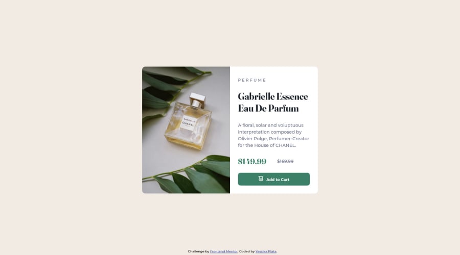
You did an excellent job here with this card as your first FEM project, and I think the use of a media query here is a good start. How we normally pick a media query really depends on what we want the user to see. For example, you chose 375px as the point where the component changes into the desktop view with the two columns; see if you can have a look at what happens at around 380px to 395px in the inspector in your browser with the responsive mode on.
For me, I see that there are two columns, and the perfume bottle is half hidden. Normally, that might not be what we want the user to see. What I might do is to choose a breakpoint when I think the view is optimal, as in, everything looks good, nothing looks squished or out of place, and for me, it looks like 550px works here with your code. Before that point, I might not want the mobile view to have a width of 550px; I would prefer to have some space around the card, and so I would set a max-width on your .card-grid of somewhere between 400px to 450px. It takes a lot of experimentation, so just keep trying, and you'll start to get a feel of what looks good and what doesn't 🙂
Just a few more points to make:
-
One suggestion I have is to start your design with a mobile first approach, meaning that you start writing the code for the mobile view and then use a media query for the desktop view.
-
Your mobile image is actually not showing up at all; that's because your media query for the image is placed before the desktop image, and so due to the nature of CSS, the desktop image will always be used. All you need to do is place the media query at the end. You can also try using the
pictureelement for the image instead, especially images that relate to content because that would be better for accessibility. Thepictureelement allows you to put more than one image inside, and you can use a media query to tell the browser which image to choose. That way, you won't have to write a media query for the images! -
In the mobile view, the height of the image and the text are the same, but in the design, the image is shorter than the text area. This is because you used a
1fr 1frfor the grid rows. For the column view, I actually suggest you use flexbox instead of grid, but in case you're more comfortable with grid, then I would say try a different proportion, such as1fr 1.5fr.
Hope this helps you out, and you're doing great, so keep going!

