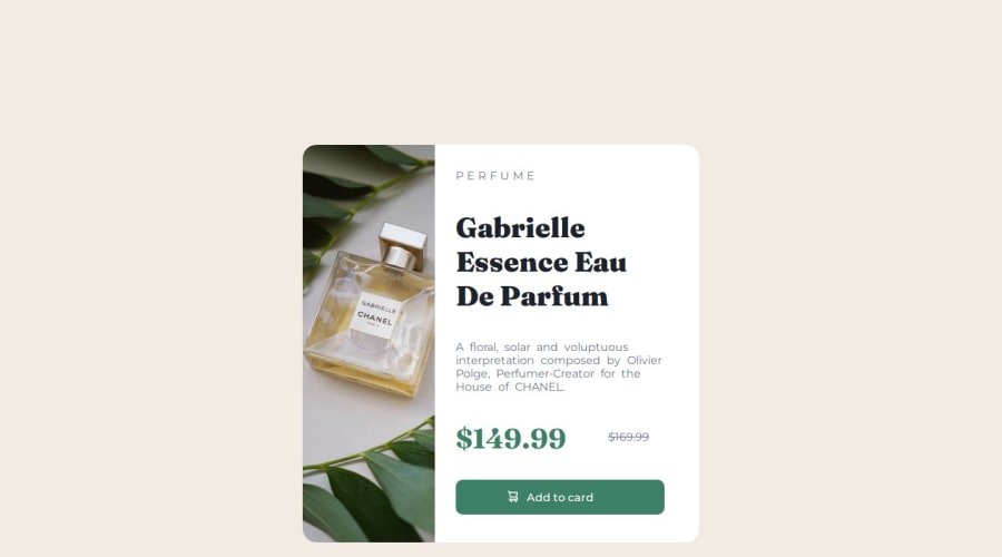


Design comparison
SolutionDesign

Community feedback
- P@r4w311aPosted 3 months ago
Great job on the design! The layout looks clean and responsive. One suggestion to improve the flexibility of your code is to avoid using a hard-coded margin like margin: 200px on the main element. Instead, consider using relative units (like % or em) or padding combined with auto margins for centering. This will make your layout more adaptable to different screen sizes. Keep up the great work!
Marked as helpful0

Please log in to post a comment
Log in with GitHubJoin our Discord community
Join thousands of Frontend Mentor community members taking the challenges, sharing resources, helping each other, and chatting about all things front-end!
Join our Discord