Product preview card component - Solution
Design comparison
Solution retrospective
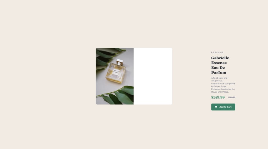
I struggled to keep all the contents, next to the image, in the div when the width decreases. The only solution I know is to use the overflow property in css. It would be much appreciated if someone could tell me how to eliminate overflow. I noticed that , I repeated my code most of the time. Could someone show me how I could refactor my code and also resources that could help with code reuse and custom css. Thank you
Community feedback
- @EngineerHamzieyPosted over 2 years ago
Hello there ☺️ You have done a great job by completing the challenge and asking question. Here are my suggestions:
- Using flexbox for the section was a good idea but instead of
height: 100vh;, usemin-height: 100vh;, using min height is the best so that it will grow bigger(increase in height) when needed. I.e it will be responsive. - Don't give width to the card use max-width: instead; instead, let it grow wide as needed. 😆 Typing on a mobile phone is like a pain in the next, I'll hopefully add more suggestions in the next few hours when I get to my PC. I hope you found this helpful 😊
1@xtoby-1Posted over 2 years ago@EngineerHamziey Thank you for the feedback . Much appreciated :)
1 - Using flexbox for the section was a good idea but instead of
Please log in to post a comment
Log in with GitHubJoin our Discord community
Join thousands of Frontend Mentor community members taking the challenges, sharing resources, helping each other, and chatting about all things front-end!
Join our Discord
