

Design comparison

Solution retrospective
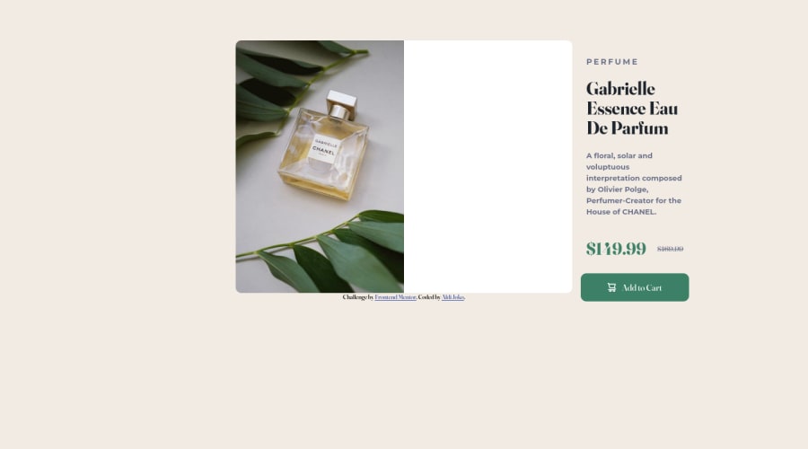
need some advice for mobile design, because in this section, my trouble is in the size of the card and the size of the image and i dont know why when i submit this solutin, my content on the right side, is out from the card
Community feedback
- @fatlindshehuPosted over 2 years ago
Hi @aldijoko, I think you don't need a container and a card for the component, you can center the component by:
- Making body a flex container and using justify-content: center & align-items: center ( Same as u did with container) make sure u give the body a 100vh height in order to center the component vertically
- I would recommend using rem units instead of px
- The card should have a border-radius and a overflow:hidden in order for the image to have rounded corners.
- The image should have a width ending with a unit ( ex. 30rem) and not width: auto that's why in mobile the img is becoming so big.
- Because the content is the same size, the component should only change its direction, the size is the same (The img size in smaller screens should change depending on the design)
Hope you manage to solve this, if you have any issue feel free to mention me in the comments
0@aldijokoPosted over 2 years ago@fatlindshehu if you dont mind, i want to ask what is difference between when using rem and px? maybe i will try tou using rem for the next challange to understand how its works
0

Please log in to post a comment
Log in with GitHub
Join our Discord community
Join thousands of Frontend Mentor community members taking the challenges, sharing resources, helping each other, and chatting about all things front-end!
Join our Discord