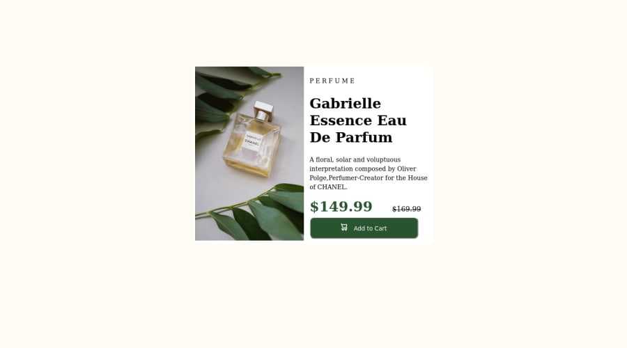
Product preview card component solution
Design comparison
Solution retrospective
Respected Community members, This is Pravallika who wants to pursue a career in web development. I have started just now and I am so hungry to achieve all that I am dreaming. In this project, I built a preview card. The difficulty that I have found:
- In the design that you have provided I have found the card is a little popped up from the background which is making it look so nicer. But I am unable to find what property I need to use to make my preview card also to look like that.
- I have found from the design that you have provided that the border is having some radius and on my website also I have provided some radius to the border but it was not that satisfactory. These are the difficulties that I found and I am hoping that you will reply to me soon with some solutions and with some feedback. I would love to hear feedback from you.
Community feedback
- @PravallikaChilakamarthiPosted almost 2 years ago
Hello @kush-x7, I have just seen your source code. your code is very neat and very simple to understand. Thanks for your valuable feedback. The way you have styled was so amazing and I will definitely start to think out of the box. Thank you..Nice work..Happy coding..
0 - @kush-x7Posted almost 2 years ago
Hello Pravallika, You have done good work! 😁
- I just checked your code and the design was looking good but you made the whole design using
tableswhich we were not supposed to do. - Change your tables into divs.
- Also you can check my solution and then tag me here So I will guide you step by step
You can have a look at my solution.
Hope you like it 😉 and Happy coding!
0 - I just checked your code and the design was looking good but you made the whole design using
Please log in to post a comment
Log in with GitHubJoin our Discord community
Join thousands of Frontend Mentor community members taking the challenges, sharing resources, helping each other, and chatting about all things front-end!
Join our Discord
