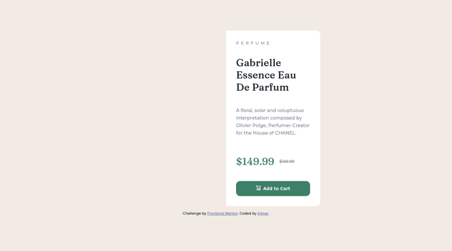
Design comparison
Solution retrospective
Despite Newbie category, this challenge is harder than I expected. I still have issues with responsive design, despite watching tutorial videos on this.
All feedback appreciated.
Community feedback
- @lawal-sherif-itunuPosted about 2 years ago
This is a nice work, keep it up. But, it is cool to note that it isn't a nice way of practice to use px in your work rather than rem or em. "Rem and pixel (px) are two units of measurement frequently used in CSS and HTML to define font size, margin or image size for example. However, the two units have a big difference in terms of web accessibility, because a pixel is not responsive and that's why it's better to use REM." Also, you shoudn't have used a fixed width on the card. you could have used stuff like (width: min(90%, 22rem);).
Also, you shouldn't have given those features to the body rather the div with the class "card".
moreso, you can use "margin-inline: auto" on the card. that would have made your work centralized rather than pushed to one side
0
Please log in to post a comment
Log in with GitHubJoin our Discord community
Join thousands of Frontend Mentor community members taking the challenges, sharing resources, helping each other, and chatting about all things front-end!
Join our Discord
