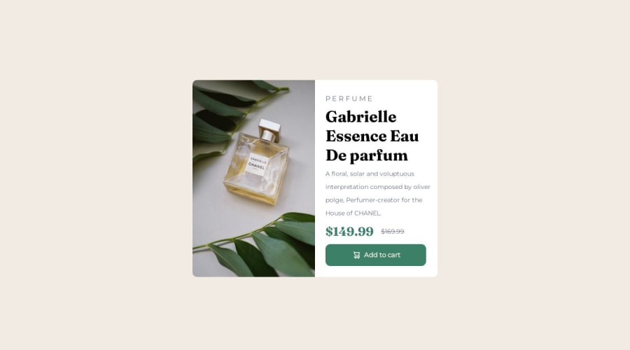


Design comparison

Solution retrospective
struggled a lot on the right side ( the description of the product ) . I couldn't adjust them properly and i have used margin a lot . Feedback will be appreciated. Thank you !!!
Community feedback
- @ahmedafsaPosted 12 months ago
Hello abiskar100, Well done!
- For the text organization and white spaces inside the product details side you can group them all in a
divand applypaddingto leave some space around the edges. Then useflexboxandgapproperty to control the spacing between them, like the follwing:
.product-info {
  padding : 3rem
  display: flex;
  flex-direction: column;
  gap: 2rem;
}
Don't forget to adjust the numbers because I set them randomly as examples :P
Some suggestions to enhance the code further:
- CSS Grid is best for the two-dimensional layouts with many elements that need to be precisely positioned relative to each other, while Flexbox is better for one-dimensional or single-line layouts where you just need to space a bunch of elements a certain way. So in case of the card in the challenge, it's better to use CSS Grid like the following:
.your-container-div {
  display: grid;
  grid-template-columns: 1fr 1fr;
  max-width: 600px;
}
This will align the product image (left-side) next to the details (right-side) directly, making the code better and easier and It will also help us in making the component responsive by converting the layout from two columns to one column through media query, like this:
@media(max-width:600px) { .your-container-div { grid-template-columns: 1fr; } }- Regarding the product image It is better to use the
<picture>element with<source>tags to make the product image responsive where based on your screen width, the appropriate image will be loaded
<picture> <source srcset="images/image-product-mobile.jpg" media="(max-width: 600px)" /> <source srcset="images/image-product-desktop.jpg" media="(min-width: 601px)" /> <img src="images/image-product-desktop.jpg"/> </picture>- You can add a nice hover effect to the button and use
cursor: pointerto inform the user that this button is clickable
.button:hover { background-color: hsl(212, 21%, 14%); cursor: pointer; }- The structure could benefit also from more semantic HTML elements like
<header>, <main>, <section>, or <article>. They help screen
I hope these suggestions are helpful. Best wishes to you!
Marked as helpful0 - For the text organization and white spaces inside the product details side you can group them all in a

Please log in to post a comment
Log in with GitHub
Join our Discord community
Join thousands of Frontend Mentor community members taking the challenges, sharing resources, helping each other, and chatting about all things front-end!
Join our Discord