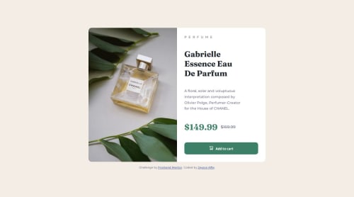
Product preview card component

Solution retrospective
I am happy that I got a chance to learn new things such as how to arrange my html to give the page great structure and also I got to learn new tags. It was also greate upgrading from using CRA to Vite when creating the react application. I was also able to add a bit of code to my CSS reset.
What challenges did you encounter, and how did you overcome them?Still approaching the application from mobile first is a challenge but I will still look more into it and figure it out. I was able to take time around it but I had to design for desktop first to be able to then change it into mobile.
What specific areas of your project would you like help with?Any feedback will be highly appreciated and also feedback in regards to mobile first approach and also styling techniques.
Please log in to post a comment
Log in with GitHubCommunity feedback
No feedback yet. Be the first to give feedback on jaysonalfie's solution.
Join our Discord community
Join thousands of Frontend Mentor community members taking the challenges, sharing resources, helping each other, and chatting about all things front-end!
Join our Discord