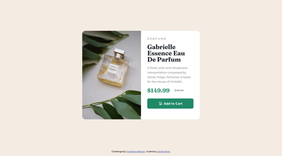
Design comparison
SolutionDesign
Community feedback
- @VCaramesPosted almost 2 years ago
Hey there! 👋 Here are some suggestions to help improve your code:
Congrats on completing your first challenge!🎊🎆
- Best practice ✅, before moving on to the next challenge, always check your FEM report, to see what is incorrect and update your code with it so that you would not make the same mistake over again. This something that should be done right after submitting your challenge.
- ⚠️ Swap this
<article class="product">for amainelement.
- The image’s
alt tagdescription needs to be improved upon ⚠️. Assume that you are describing the image to a someone over the phone.
More Info:📚
https://www.w3.org/WAI/tutorials/images/
- This component requires the use of two images 🎑 at different breakpoints ⚠️. The
pictureelement will facilitate this.
Here is an example of how it works: EXAMPLE
Syntax:
  <picture>
    <source media="(min-width: )" srcset="">
    <img src="" alt="">
  </picture>
More Info:📚
https://www.w3schools.com/html/html_images_picture.asp
- Currently, the old price (169.99) 🏷 is not being properly announced 😢 to screen readers. To fix this, you are going to wrap the the price in a
delelement and inside it you will add aspanelement with ansr-only classthat will state something like “The previous price was…” and use CSS to make it only visible to screen readers.
More Info:📚
If you have any questions or need further clarification, feel free to reach out to me.
Happy Coding! 🎆🎊🪅
Marked as helpful1@dnoracPosted almost 2 years ago@vcarames Thank you for your feedback. I have updated the challenge with your suggestions. ✅
0
Please log in to post a comment
Log in with GitHubJoin our Discord community
Join thousands of Frontend Mentor community members taking the challenges, sharing resources, helping each other, and chatting about all things front-end!
Join our Discord
