Submitted over 2 years ago
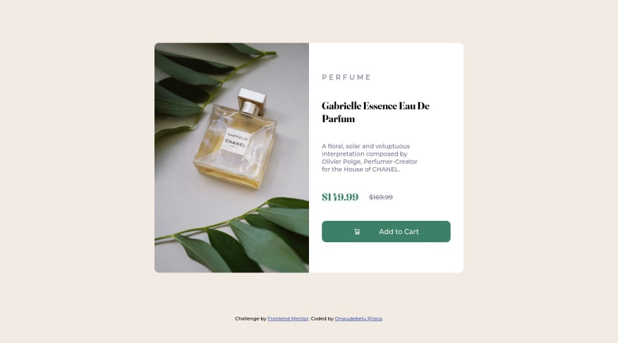
Product Preview Card Component ( Responsive)
@PriscaTonia
Design comparison
SolutionDesign
Community feedback
- @iyke-ePosted over 2 years ago
Nice work you should try to increase the header text to look like what is on the design then on ur button the cart is far from the text
0
Please log in to post a comment
Log in with GitHubJoin our Discord community
Join thousands of Frontend Mentor community members taking the challenges, sharing resources, helping each other, and chatting about all things front-end!
Join our Discord
