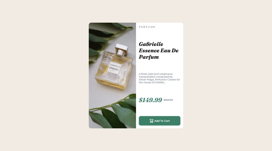
Product Preview Card Component Responsive Design using Flexbox
Design comparison
Solution retrospective
Hi, Everyone. This is the third challenge I completed on frontendmentor. With every challenge, I try to improve my methodology, thought process, responsiveness, and code quality. Feedbacks are something I am looking for. Your feedback and suggestions would be much appreciated.
Thank You
Community feedback
- @mseidel819Posted over 1 year ago
Looking at your semantic markup--
You want to consider screen readers. If you couldn't see your page, and a robot was describing it to you, would it be clear?
First thing, I think you should change your
<div class="add-to-cart-btn">from adivto abutton. That will signal to the computer that you have a button that is supposed to do something.For your header elements, think about how you rank the most important things. This Can line up with font sizes, but not always. In this case, I think the first thing that the viewer needs to know is the product name- this should probably be your
<h1>. after that, the<h4 class="segment">Perfume</h4>could probably be<h2>. The prices could probbly end up being<span>elements. I don't think prices are considered semantic elements. (but don't quote me on that.)Marked as helpful0
Please log in to post a comment
Log in with GitHubJoin our Discord community
Join thousands of Frontend Mentor community members taking the challenges, sharing resources, helping each other, and chatting about all things front-end!
Join our Discord
