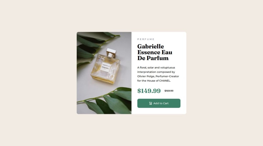
Design comparison
Solution retrospective
I think I came pretty close. I don't know if all the colors are correct, because I didn't see all of the ones mentioned in the style-guide actually being applied on the MockUp. I don't think I had to use the two blue colors once. But I had to color pick and then add another even darker cyan. that wasn't even mentioned in the style guide, for the active effect on the button.
What challenges did you encounter, and how did you overcome them?The Media Query stuff was a bit tricky at first, but it was pretty cool to figurte out how to make one image appear and the other one dissapear. For the mobile screen version I had to adjust the margin between the text elements in order to look like the MockUp. Maybe there is a better way, by applying flex to the divs, but I don't know.
What specific areas of your project would you like help with?If you find any flaws or mistakes or know any better ways to code, let me know.
Community feedback
- @AbdullahHamadaxPosted 11 months ago
Very impressive, it's almost pixel perfect. Just change the paragraph and price color to ** --Dark_Grayish_Blue: hsl(228, 12%, 48%);**
Marked as helpful0
Please log in to post a comment
Log in with GitHubJoin our Discord community
Join thousands of Frontend Mentor community members taking the challenges, sharing resources, helping each other, and chatting about all things front-end!
Join our Discord
