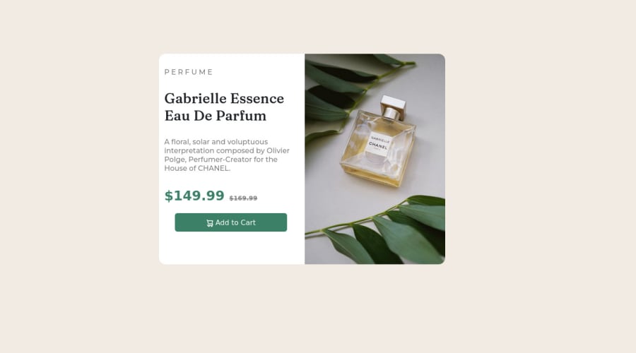
Design comparison
Solution retrospective
creating responsive images and grid creating responsive images
Community feedback
- @catherineisonlinePosted almost 2 years ago
Nice solution 🤩
To improve the code you can add alt attribute to the images and there are several tips you need to follow. If the image is just for decoration you can still write alt attribute but leave it empty, such images don’t need any alt tag but you will need to also add aria-hidden=“true”.
According to MDN “The alt attribute holds a text description of the image, which isn't mandatory but is incredibly useful for accessibility — screen readers read this description out to their users so they know what the image means. Alt text is also displayed on the page if the image can't be loaded for some reason: for example, network errors, content blocking, or linkrot.“
IF THIS WAS HELPFUL PLEASE MARK IT AS HELPFUL 🤩
Marked as helpful0 - @VCaramesPosted almost 2 years ago
Hey there! 👋 Here are some suggestions to help improve your code:
- To not only improve your HTML code but to also identify the main content of you page, you will want to wrap your entire component inside the
mainelement.
More Info:📚
- Since the images in this component add value and serve a purpose (displaying the product), it is best to use the
Pictureelement and not thebackground-imageproperty, as it will to use different images during different breakpoints.
- The only heading in this component, is the name of the perfume; “Gabrielle Essence Eau De Parfum” . The rest of the text should be wrapped in a
paragraphelement.
- Currently, the old price (169.99) 🏷 is not being properly announced to screen readers. To fix this, you are going to wrap the the price in a
delelement and inside it you will add aspanelement with ansr-only classthat will state something like “The previous price was…” and use CSS to make it only visible to screen readers.
More Info:📚
If you have any questions or need further clarification, feel free to reach out to me.
Happy Coding!🎄🎁
Marked as helpful0@nish8888888888Posted almost 2 years ago@vcarames Thanks for helping me out. I have one question, can you add picture tag inside a div tag since picture itself acts as container and blocks any other elements to sit next to it. how can I avoid this.
0@VCaramesPosted almost 2 years ago@nish8888888888
Glad I could help!
You definitely can. This challenge will require it so, so that the images and text content are together.
Keep it up!
0 - To not only improve your HTML code but to also identify the main content of you page, you will want to wrap your entire component inside the
- @melkhateeb193Posted almost 2 years ago
that a great job you have done here but there some mistake i hope that you accept it from me
<h6>P E R F U M E</h6> instead of use <h1> PERFUME</h1> and you have used more than h6 in the same design and it not recommended in the web and google fonts is recommended to be used in the css sheet not in HTML and its optional <button type="button" class="btn"><img src="images\icon-cart.svg"> Add to Cart</button> the button should lead somewhere so put the same button inside <a></a> and increase the padding of the text hope thats helps youMarked as helpful0
Please log in to post a comment
Log in with GitHubJoin our Discord community
Join thousands of Frontend Mentor community members taking the challenges, sharing resources, helping each other, and chatting about all things front-end!
Join our Discord
