Submitted about 2 years ago
Responsive Preview Card using React, MUI and Typescript
#material-ui#react#typescript

@Gaurav4604

Design comparison
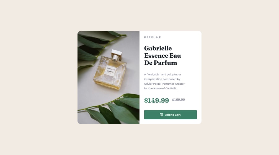
SolutionDesign

Solution retrospective
Hi everyone! I've implemented this challenge using Flexbox, Is it viable to use Grid for the same?
What parts of my styling can be improved upon?
Community feedback
Please log in to post a comment
Log in with GitHub
Join our Discord community
Join thousands of Frontend Mentor community members taking the challenges, sharing resources, helping each other, and chatting about all things front-end!
Join our Discord