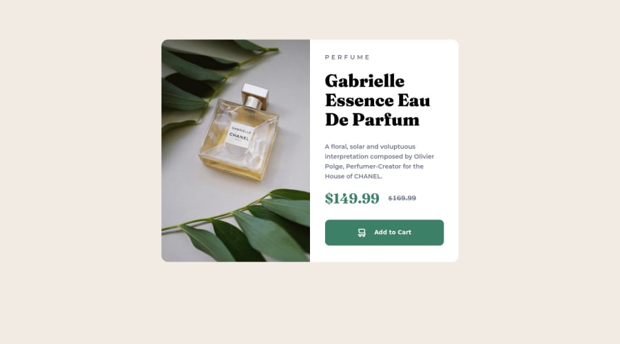
Not Found
Not Found
Not Found
Not Found
Not Found
Not Found
Not Found
Not Found
Not Found
Not Found
Not Found
Not Found
Not Found
Not Found
Not Found
Not Found
Not Found
Not Found
Not Found
Not Found

Submitted

Product preview card component

NicoR23β€’ 120

@NicoR23

Desktop design screenshot for the Product preview card component coding challenge

This is a solution for...

  • HTML
  • CSS
1newbie
View challenge

Design comparison


SolutionDesign

Solution retrospective


I did it with what I know, which is probably not correct what I did, so any comments about it would help me to improve.

Community feedback

Francisco Carrilloβ€’ 5,540

@frank-itachi

Posted

Hello there πŸ‘‹. You did a good job!

I have some suggestions about your code that might interest you.

HTML πŸ“„:

  • Since the mobile design has a different image, you can use the <picture> tag that allows you to interchange the images depending of the viewport size. Red more about this awesome tag here

I hope you find it useful! 😁😁 Above all, the solution you submitted is greatπŸ‘Œ!

Happy <coding /> 😎!

Marked as helpful

1

NicoR23β€’ 120

@NicoR23

Posted

@frank-itachi Thanks, I didn't know about her, I still need to learn a lot

0
Hassia Issahβ€’ 50,650

@Hassiai

Posted

Add a tittle tag ,<tittle> within the head tag of the html file to fix the error issue. the content of the tittle tage is the tittle of the html document.

Wrap the entire content in the html tag within the main and replace the main tag with a section tag and the div containing the img with a figure tag. sample:

<main>
<figure><img></figure>
<section>
----content is here
</section>
</main>

Replace the height in .card with a padding value for all the sides, this will prevent the content from overflowing on smaller screens and its a responsive replacement.

Use relative units like rem or em as unit for the padding, margin, width values and preferably rem for the font-size values, instead of using px which is an absolute unit. For more on CSS units Click here

In the mobile design, give the main a max-width value for a responsive content. max-width: 500px and in the media query add display: grid and grid-template-columns: 1fr 1fr to the main instead of giving the body grid-template values in the css.

Hope am helpful.

Well done for completing this challenge. HAPPY CODING

Marked as helpful

1

NicoR23β€’ 120

@NicoR23

Posted

@Hassiai Thank you for your comment, I will try to improve.

0

Please log in to post a comment

Log in with GitHub
Discord logo

Join our Discord community

Join thousands of Frontend Mentor community members taking the challenges, sharing resources, helping each other, and chatting about all things front-end!

Join our Discord