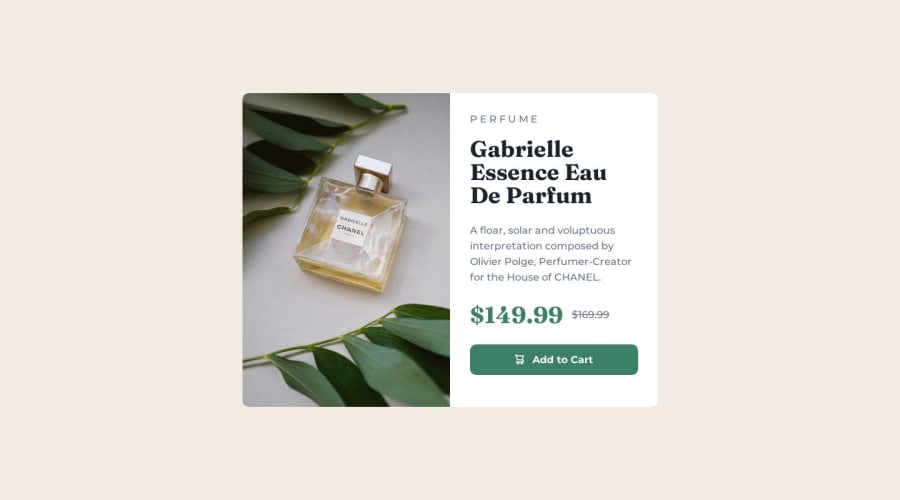
Design comparison
SolutionDesign
Solution retrospective
This challenge helped me understand display: flex; and flex direction. All feedback is welcome thank you in advance.
Community feedback
- @kdubrovskyPosted over 1 year ago
Hi! Nice work! Let me to highlight two tiny things to improve your solution:
- The button is breaking on ≈570px breakpoint. You should fix button markup and get rid of
padding-left: 27%and make it with justify-content property of flex item - Don't forget — you have to set width of the most of element to 100% at mobile view. Feel free to explore my solution at GitHub.
All the best for you!
Marked as helpful0@UvejsiiPosted over 1 year ago@kdubrovsky Thanks for your feedback. I'll try to fix the things you mentioned.
0 - The button is breaking on ≈570px breakpoint. You should fix button markup and get rid of
Please log in to post a comment
Log in with GitHubJoin our Discord community
Join thousands of Frontend Mentor community members taking the challenges, sharing resources, helping each other, and chatting about all things front-end!
Join our Discord
