Not Found
Not Found
Not Found
Not Found
Not Found
Not Found
Not Found
Not Found
Not Found
Not Found
Not Found
Not Found
Not Found
Not Found
Not Found
Not Found
Not Found
Not Found
Not Found
Not Found

Submitted

Product Preview Card Component (Perfume)

threshold 50

@thresholdtech

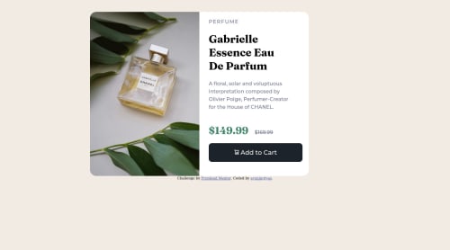
Desktop design screenshot for the Product preview card component coding challenge

This is a solution for...

  • HTML
  • CSS
1newbie
View challenge

Design comparison


SolutionDesign

Solution retrospective


Hi Guys,

this is my fifth project. Well, it's so confusing tbh, and here's my result. I use 'grid' here, to divide the image and the text, I don't know if that is the right choice. I have an issue here, the discount price won't be centered when I use vertical-align: middle, any adv? TIA

Community feedback

@Dr-Vegapunk007

Posted

Hi @thresholdtech, you can use this to centered the discount price

.price-remark{
display: flex ;
align-items: center ;
}
.h1,
.h4{
margin:0 ;
}

I use different method to do it in my solution you can see it here : https://dr-vegapunk007.github.io/

0

threshold 50

@thresholdtech

Posted

Hiii @Dr-Vegapunk007 ,

thank you so much for your suggestion, really appreciate it. I will try to apply it. Yours is well finished btw!

0
Fancy 320

@maciejkrol18

Posted

Centering the discount price

The easiest way to solve your problem would be to make the div with the class of price-remark a flex container, and then apply align-items: center; to it, so that everything is centered vertically. Then, you can either apply a small left margin to the discounted price or use gap property on the flex container itself. You shouldn't use the vertical-align property in this case.

Frontend Mentor's HTML validation report

You've used backslashes to link the images (\). You should use normal slashes (/) instead.

Frontend Mentor's Accessibility report

All content should be contained by landmarks

Look up Semantic HTML - https://www.w3schools.com/html/html5_semantic_elements.asp You should use a <main> tag instead of a simple <div> to improve the site's accessibility.

Headings should only increase by one

The perfume's name is a h1 and then you jump to h4 with the perfume's description. On that note, you shouldn't use a heading tag for a description. I would change it to a paragraph tag.

Other

Fix your "Add to cart" button's background color and add the hover state

0

threshold 50

@thresholdtech

Posted

hi @FancyBaguette, first, thank you for your time checking on my work, I really appreciate it. I never heard about the landmark previously, thanks for the link. I'll check it. Noted for your suggestions. tia. happy coding :)

1
Adeola Ganiu 1,320

@Deolabest

Posted

Hey @thresholdtech, Congratulations on completing this challenge!

Here is my feedback:

  • Use <main> instead of a simple <div> to improve the semantics and accessibility on the page. Remember that every page should have a <main> block and that <div> doesn't have any semantic meaning.

  • Don't use px to set font-size. Instead use rem units, they are great since they adapt better to the font-size the user will set in the browser settings. You can convert from px to rem here: https://pixelsconverter.com/px-to-rem.

  • The right background color for the button is background-color: hsl(158, 36%, 37%); while the hover effect is background-color: hsl(212, 21%, 14%);

  • Regarding your question, add margin-bottom: 0.7rem; to the price.

Keep doing a good job!

0

threshold 50

@thresholdtech

Posted

hi @Deolabest, Thank you for your time checking on my work, really appreciate it. I note every suggestion you made, it really means a lot to me. I will correct the background and the hover-effect. tia. happy coding :)

0

Please log in to post a comment

Log in with GitHub
Discord logo

Join our Discord community

Join thousands of Frontend Mentor community members taking the challenges, sharing resources, helping each other, and chatting about all things front-end!

Join our Discord