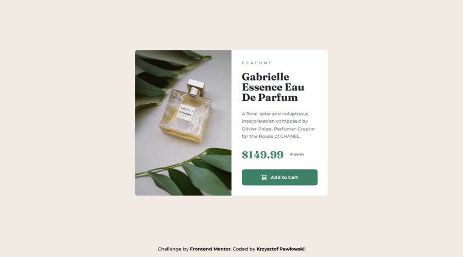
Design comparison
Community feedback
- @artemkotko14Posted 5 months ago
Your desktop design looks great. However the image stays the same when switch to a small screen. To switch your image based on the screen size I would advice you to use picture element. Also, I would not suggest to use h1 for a small ribbon text above the name of the product. h1 must indicate the primary topic of your webpage. hgroup element with heading and paragraph Parfume for this would be much better practice. Hope this will be helpful for you. Keep on coding!
Marked as helpful1
Please log in to post a comment
Log in with GitHubJoin our Discord community
Join thousands of Frontend Mentor community members taking the challenges, sharing resources, helping each other, and chatting about all things front-end!
Join our Discord
