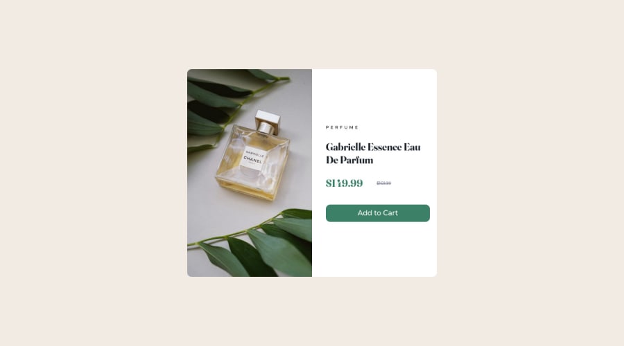
Design comparison
Solution retrospective
I have tried to make it as simple as possible. That means with the less code lines as I could. I also have tried to see how other did it and made a mix of the best practices I have seen out there.
Do you think it can be improved or done with less code lines yet? Please tell me then!
Community feedback
- @sahand-masolehPosted over 2 years ago
Hey there! I see that you have left the text bit out, was that intentional, that's kinda of important you know. :D
By the way, you have a master branch and a main branch for your source control, try to merge them both into one.
Marked as helpful1@OscarandioPosted over 2 years ago@sahand-masoleh Thank you. I have fixed all this now!
1@sahand-masolehPosted over 2 years ago@Oscarandio You are quick my friend! Now I see that you have set a height on your "col" element, this means that if your view width is narrow enough (e.g. 250px), your content will overflow out of your card.
I would create a "card" element with an unset height, put both the picture and the content inside it, and set a height for the image element only, this way the text will determine the size of your card and will always remain inside it.
Marked as helpful1
Please log in to post a comment
Log in with GitHubJoin our Discord community
Join thousands of Frontend Mentor community members taking the challenges, sharing resources, helping each other, and chatting about all things front-end!
Join our Discord
