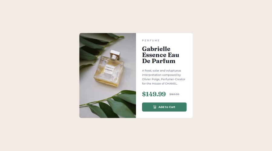
Product Preview Card Component | Next.js, Typescript, Tailwind CSS
Design comparison
Community feedback
- @rafbar2000rrPosted 6 months ago
Nice work. The desktop design is perfect, concerning to the mobile design, I see that the paragraphs are not exactly the same because it has less number of lines than the model. I would only reduce the article width a little so that the paragraphs will increase its number of lines. I see a good padding and good margins, and that's all I will do. Almost a perfect work.
0P@tloyanPosted 6 months ago@rafbar2000rr
Hi, On which device and screen size did you test it? I actually built it using a Chromium-based browser.
0@rafbar2000rrPosted 6 months ago@tloyan I tested it on my Xiaomi 360px, but I have seen that the number of lines in each paragraph is not important, it all depends on the viewport for each kind of mobile phone. I see your work perfect, the number of lines is relative.
1
Please log in to post a comment
Log in with GitHubJoin our Discord community
Join thousands of Frontend Mentor community members taking the challenges, sharing resources, helping each other, and chatting about all things front-end!
Join our Discord
