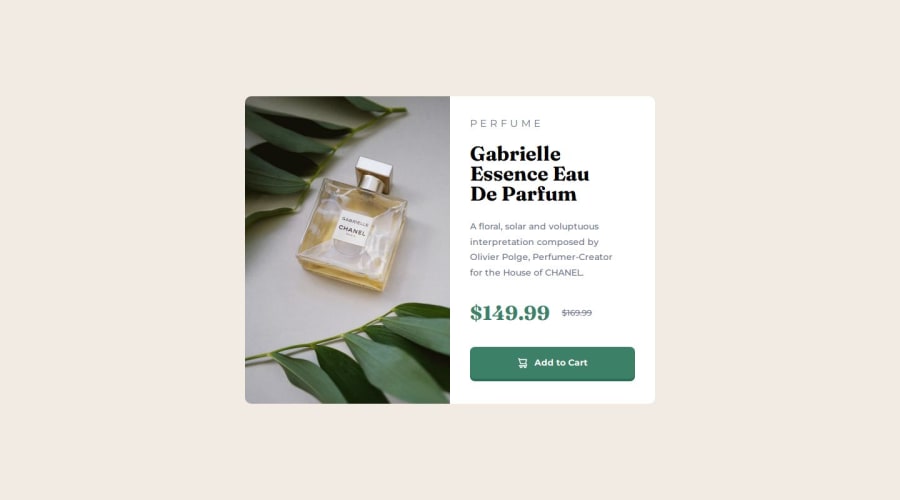
Design comparison
Solution retrospective
I'm most proud of how I take the challenge on the responsiveness of the card. The thing I would do next time is to limit my media query. I think the responsiveness of this project can be done even though there is no media queries. I'm not sure hehe
Your feedback is highly appreciated 😊😊😊
What challenges did you encounter, and how did you overcome them?The challenge that I encountered from this challenge are the sizing of the max-inline-size of the card and the spacing when the card is in a desktop view by doing a trial and error of the values I was able to overcome this challenge.
I'm not sure if it's efficient or a good thing to do a trial and error on a value if I'm working on a real-world project. Do you think I should know the calculation of the sizes and spacing without doing a trial and error?
Let me know your thoughts 🧐🧐🧐
What specific areas of your project would you like help with?For this challenge I didn't need any help on areas. But Your feedback is highly appreciated 😊😊😊
Please log in to post a comment
Log in with GitHubCommunity feedback
No feedback yet. Be the first to give feedback on Ralph Virtucio's solution.
Join our Discord community
Join thousands of Frontend Mentor community members taking the challenges, sharing resources, helping each other, and chatting about all things front-end!
Join our Discord
