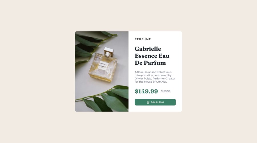
Product preview card component main using simple HTML & CSS


Design comparison

Solution retrospective
I am having issues with the responsiveness.
Community feedback
- @itushPosted over 1 year ago
Congratulations on completing the challenge! 🎉
Nice attempt:)
-
Feel free to go through my product preview project code and notice how I handle responsiveness with mobile and desktop product images.
-
To make it mobile responsive it is important to first understand how different breakpoints work with the media queries, which breakpoints to target, how to apply different styling to the same element at different breakpoints etc.
-
Looking at the designs, you need to decide for how many breakpoints you wish to modify the same layout and add media queries accordingly.
-
Designs only change at defined media query breakpoints. We have two options... either we can target a breakpoint apply some changes for that breakpoint and up screens or the same breakpoint and down screens.
-
For example, If you want to make the body blue @600px then you also need to decide whether the body remains blue on 600px and up screens or 600px and down screens. If you decide to maintain a blue background for 600px and up screens you'd use
@media only screen and (min-width: 600px) {...}and@media only screen and (max-width: 600px) {...}for the opposite scenario. And lets say @500px you want a red background and @700px you need a yellow background, then you need to follow the same drill. -
Please note: There are tons of screens and devices with different heights and widths, so it is hard to create an exact breakpoint for each device. To keep things simple we target the typical five groups of breakpoints. However, You can add as many breakpoints as you like to make it more responsive.
In my projects:
- I always start with mobile-first workflow.
- I use at least one main element for a page (entire content goes into the main, if I'm not using header & footer), and avoid divs as much as possible and use section and article element wherever I can.
<body> <main> All content </main> </body>-
I Use relative units as much as possible and avoid absolute units whenever possible.
-
If you are someone who is just starting out with front-end development, I strongly suggest starting with the QR code component project(which you did). Also in the challenges page you may filter by (Newbie, HTML&CSS) sort by (easier first) to select projects that will help you solidify your foundation. To avoid any potential knowledge gap⚠️ please first solidify HTML, CSS, JS fundamentals, make few projects only with the trio and then move on to any framework or library.
-
I remember when I started out, I made countless mistakes and spent long hours searching for solutions. But hey, you don't need to go through the same struggles! 🙌 To help you shorten the learning curve, I recommend going through the following articles. They contain valuable insights that can make your journey smoother:
📚🔍 12 important CSS topics where I discuss about css position, z-index, box-model, flexbox, grid, media queries, mobile-first workflow, best practices etc. in a simple way.
📚🔍 11 important HTML topics where I discuss about my thought process and approach to convert a design/mock-up to HTML along with important topics like block and inline elements, HTML Semantic Elements.
I hope you find these resources somewhat helpful in your coding adventures! 🤞
I'm eagerly looking forward to seeing the amazing projects you'll create in the future! 🚀💻
Keep up the fantastic work and happy hacking! 💪✨
0 -

Please log in to post a comment
Log in with GitHub
Join our Discord community
Join thousands of Frontend Mentor community members taking the challenges, sharing resources, helping each other, and chatting about all things front-end!
Join our Discord