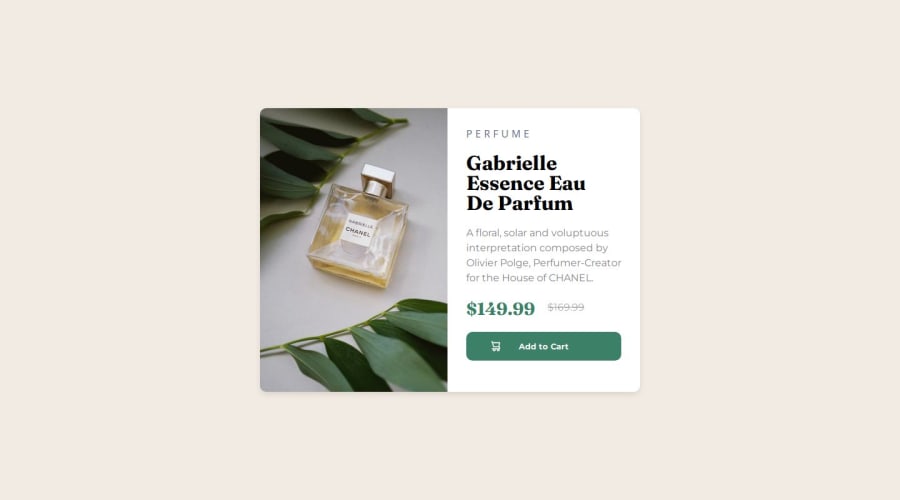


Design comparison

Solution retrospective
I think this time around, I decided to explore a little, even though I knew I could do it using what I already knew
What challenges did you encounter, and how did you overcome them?I struggled with the responsiveness because I started working on the project without considering its mobile version, which slowed me down a bit.
What specific areas of your project would you like help with?I always struggle to take screenshots of the mobile version using DevTools, so maybe that will be wonderfull.
Community feedback
- @JawadBelloAPosted 4 months ago
Instead of taking screenshots, you can use device emulation in Chrome DevTools or other browser dev tools to view the mobile version of your site in real-time. This allows you to interact with the page directly in the mobile view without needing to capture a static screenshot.
For example, Chrome DevTools has an emulation feature that lets you switch to various mobile device profiles (e.g., iPhone, Galaxy, etc.) and see how your layout behaves on different screen sizes. To enable this, you just need to open DevTools (F12 or Ctrl+Shift+I), then click the device toolbar icon (or press Ctrl+Shift+M).
Another alternative is using responsive web design tools like BrowserStack or Sauce Labs, which allow you to test your site on real devices remotely. This way, you can directly interact with your site as it would appear on actual mobile devices without needing to rely on screenshots.
0

Please log in to post a comment
Log in with GitHub
Join our Discord community
Join thousands of Frontend Mentor community members taking the challenges, sharing resources, helping each other, and chatting about all things front-end!
Join our Discord