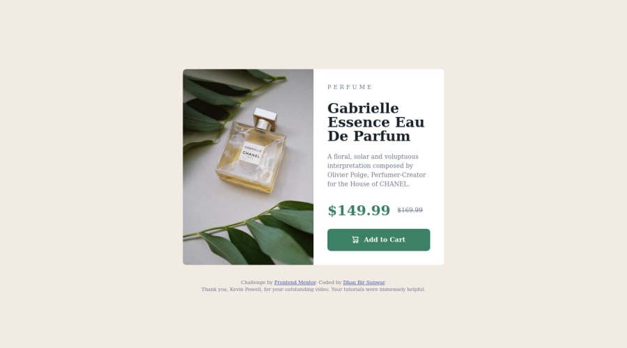
Design comparison
Solution retrospective
The following are the main issues I run into while working on this project:
- precise spacing
- precise font size
Community feedback
- @furkankucukkirisPosted almost 2 years ago
I got stuck in the font part too, but I solved it. Check my solution for font solution. And try to solve accessibility report warning. Then all look fine to me. And maybe you should delete footer part because there is no footer part in the original one.
0 - @markrajkPosted almost 2 years ago
Yes without figma file, eyeballing exact sizes is challenging. You could use an image of the design with some opacity and overlay it over your work to get the feel of the proportions (what should be bigger or smaller).
Also i think you forgot to use right fonts. Have a nice day!
0
Please log in to post a comment
Log in with GitHubJoin our Discord community
Join thousands of Frontend Mentor community members taking the challenges, sharing resources, helping each other, and chatting about all things front-end!
Join our Discord