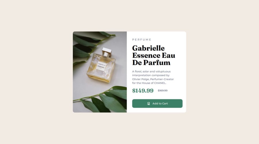
Not Found
Not Found
Not Found
Not Found
Not Found
Not Found
Not Found
Not Found
Not Found
Not Found
Not Found
Not Found
Not Found
Not Found
Not Found
Not Found
Not Found
Not Found
Not Found
Not Found

Submitted

Product preview card component main

Essencellā€¢ 50

@Essensity-dev

Desktop design screenshot for the Product preview card component coding challenge

This is a solution for...

  • HTML
  • CSS
1newbie
View challenge

Design comparison


SolutionDesign

Solution retrospective


What are you most proud of, and what would you do differently next time?

I am proud to have been able to implement responsive design.

What challenges did you encounter, and how did you overcome them?

My biggest challenge in this case was the change of image by having a container with fewer pixels but I investigated and was able to solve it with the content tag in CSS

What specific areas of your project would you like help with?

I would like help on the responsive side and when using percentages, em and rem

Community feedback

Daniel šŸ›øā€¢ 44,230

@danielmrz-dev

Posted

Hello @Essensity-dev!

Your project looks great!

I have a suggestion about your code that might interest you:

šŸ“Œ You can use the <picture> tag when you have different versions of the same image.

Using the <picture> tag will help load the correct image to the user's device, saving bandwidth and improving performance.

Example:

<picture>
    <source media="(min-width: 768px)" srcset="{desktop image path here}">
    <img src="{mobile image path here}" alt="{alternative text here}">
</picture>

I hope this helps!

Other than that, excellent work!

Marked as helpful

0

Essencellā€¢ 50

@Essensity-dev

Posted

@danielmrz-dev How can I do it if the image is too big?

0

@bienvenudev

Posted

Hi @Essensity-dev!

This is looking good! Here are a few suggestions that might make things even better:

  • For non-decorative images, consider using descriptive alt text like "Front-End Mentor QR Code" to improve accessibility for screen readers.

  • Including a modern CSS reset at the beginning of your styles can help normalize browser defaults and provide a clean foundation for your project. Check out this article: https://www.joshwcomeau.com/css/custom-css-reset/

  • Instead of setting a fixed width on your main, consider using max-width in REM units. This allows the card to adapt to different screen sizes while maintaining its layout.

  • Similar to width, avoid setting a fixed height on your main. This ensures the content can adjust to different content lengths.

  • As @danielmrz-dev mentioned you don't have to put on a media query to change an image, instead you could use the picture tag in html and let the browser load the desired image. Check out Grace's walkthrough: https://fedmentor.dev/posts/html-plan-product-preview/

  • Kevin Powell's Video on CSS Units: https://www.youtube.com/watch?v=N5wpD9Ov_To (please subscribe to his YT channel and check out his other videos) +

  • A free course on building responsive layouts (https://courses.kevinpowell.co/conquering-responsive-layouts)

I hope these are helpful! Feel free to ask any questions you might have and happy coding!

0

Please log in to post a comment

Log in with GitHub
Discord logo

Join our Discord community

Join thousands of Frontend Mentor community members taking the challenges, sharing resources, helping each other, and chatting about all things front-end!

Join our Discord