Design comparison
Community feedback
- P@jasoneczekPosted about 1 year ago
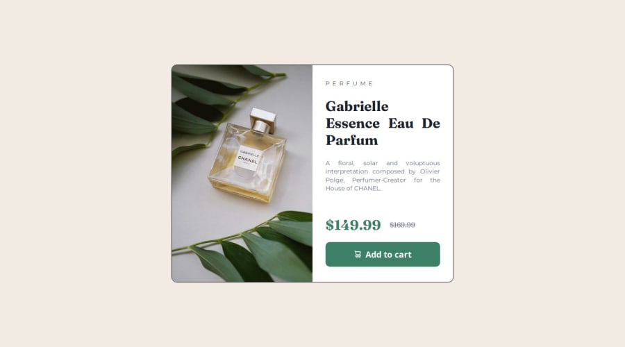
Hello Lucas, I noticed you made the main image of the perfume a background image. I think for this one a semantic image tag makes more sense since it is an important image of the product. It should have alt text too.
I don't think you need sections or articles inside your card component. If you want to divide your content into different sections like this, you can use div's.
I would check your padding around the card content as well. The text to me looks a little too close to the edge. I also don't see a solid border around the card itself. It might be a stylistic choice if you like that.
All in all it looks good, I hope some of this information helps.
Marked as helpful0
Please log in to post a comment
Log in with GitHubJoin our Discord community
Join thousands of Frontend Mentor community members taking the challenges, sharing resources, helping each other, and chatting about all things front-end!
Join our Discord
