

Design comparison

Community feedback
- @VCaramesPosted about 2 years ago
Hey @davidwilliamx, adding to what was said above/below:
-
The Alt Tag Description for the image needs to be improved upon. You want to describe what the image is; they need to be readable. Assume you’re describing the image to someone.
-
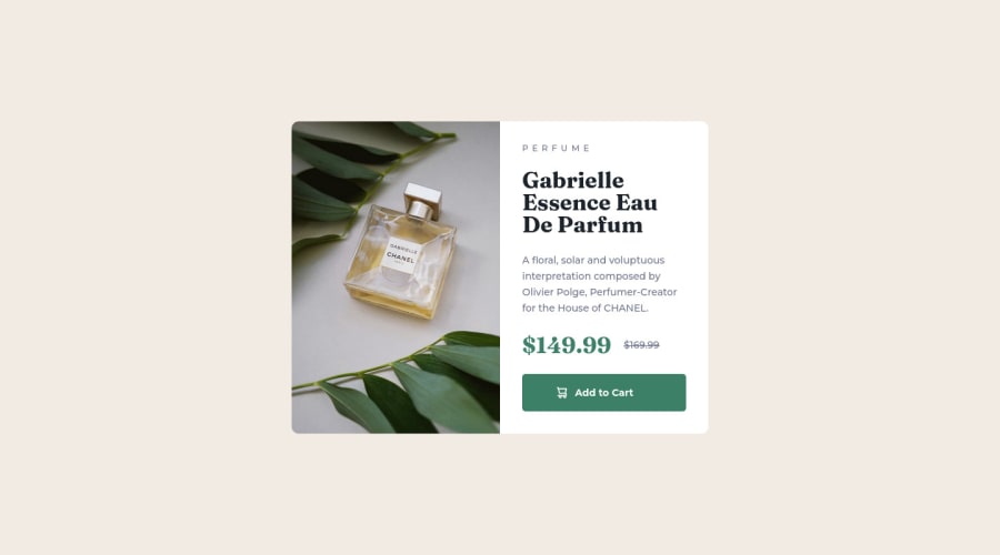
There is only one heading in this challenge and that is the name of the perfume, “Gabrielle Essence Eau De Parfum”.
-
In order to use the Article Element the content needs to be able to stand on its own and be reusable. In this case, the element can not stand on its own without the image. So the entire card should be wrapped in an Article Element and the text content will be wrapped in a Div.
-
The old price is not being announced properly to screen readers. You want to wrap it in a Del Element and include a sr-only text explaining that this is the old price.
Happy Coding!
0 -
- @correlucasPosted about 2 years ago
👾Hello @davidwilliamx, Congratulations on completing this challenge!
Your solution its almost done and I’ve some tips to help you to improve it:
1.Think about using relative units as
remoreminstead ofpxto improve your performance by resizing fonts between different screens and devices. Anyhow, if we want a more accessible website, then we should use rem instead of px. REM does not just apply to font size, but to all sizes as well.2.Use the THE PICTURE TAG that is a shortcut to deal with the multiple images in this challenge. So you can use the
<picture>tag instead of importing this as an<img>or using a div withbackground-image. Use it to place the images and make the change between mobile and desktop, instead of using adivorimgand set the change in the css withdisplay: nonewith the tag picture is more practical and easy. Note that for SEO / search engine reasons isn’t a better practice import this product image with CSS since this will make it harder to the image. Manage both images inside the<picture>tag and use the html to code to set when the images should change setting the devicemax-widthdepending of the device desktop + mobile.Check the link for the official documentation for
<picture>in W3 SCHOOLS:https://www.w3schools.com/tags/tag_picture.aspSee the example below:
<picture> <source media="(max-width:650px)" srcset="./images/image-product-mobile.jpg"> <img src="./images/image-product-desktop.jpg" alt="Gabrielle Parfum" style="width:auto;"> </picture>👨💻Here's my solution for this challenge if you wants to see how I build it: https://www.frontendmentor.io/solutions/product-preview-card-vanilla-css-and-custom-hover-state-on-hero-85A1JsueD1
✌️ I hope this helps you and happy coding!
0


Please log in to post a comment
Log in with GitHub
Join our Discord community
Join thousands of Frontend Mentor community members taking the challenges, sharing resources, helping each other, and chatting about all things front-end!
Join our Discord