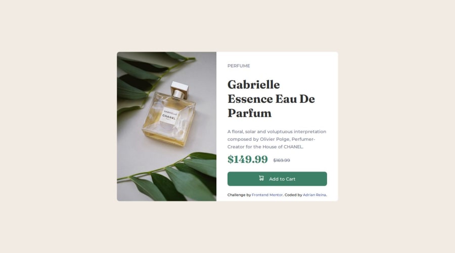
Submitted about 1 year ago
PRODUCT PREVIEW CARD COMPONENT MAIN
@adrian-reina-391
Design comparison
SolutionDesign
Solution retrospective
What are you most proud of, and what would you do differently next time?
I liked the project, I liked using CSS Grid, it is truly useful and I could practice it to understand
What challenges did you encounter, and how did you overcome them?it was hard the style the full price cut in half for a line, but I learned to do it
What specific areas of your project would you like help with?nothing
Community feedback
- @pRicard0Posted about 1 year ago
Your project looks great on my Opera GX, I didn't see what the problem is.
Some HTML tips
- You should use the tag
<em>instead of a div with the class price1. The<em>tag is used to define emphasized text. The content inside is typically displayed in italic. A screen reader will pronounce the words in <em> with an emphasis, using verbal stress. - You should use the tag
<s>instead of a div with the class price2. The<s>tag specifies text that is no longer correct, accurate or relevant. The text will be displayed with a line through it by default.
Marked as helpful1@adrian-reina-391Posted about 1 year ago@pRicard0 thanks, it's possible to edit it here or I have to upload the solution again? I noticed an error in the mobile view, when doing the media query it seems that I deleted the right paddind
0@pRicard0Posted about 1 year ago@adrian-reina-391 You just need to commit. You don't need to upload the solution again.
0 - You should use the tag
Please log in to post a comment
Log in with GitHubJoin our Discord community
Join thousands of Frontend Mentor community members taking the challenges, sharing resources, helping each other, and chatting about all things front-end!
Join our Discord
