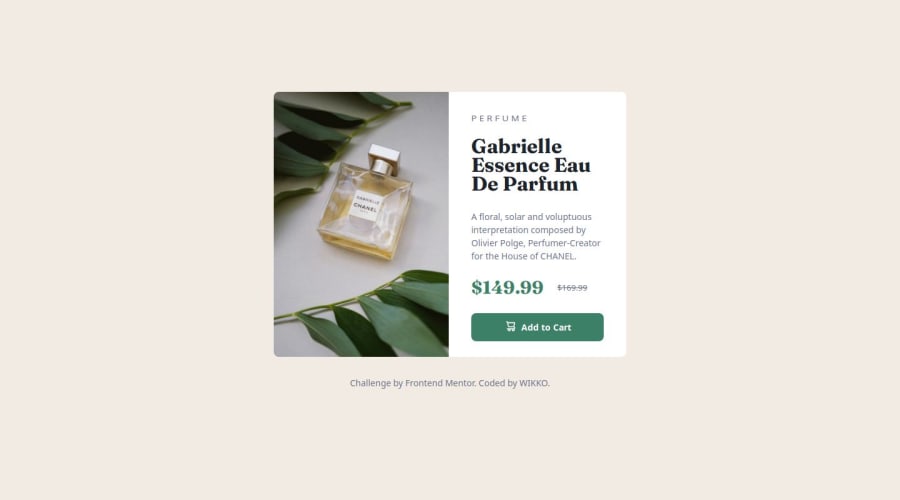
Product Preview Card Component made by ActuallyWIKKO


Design comparison

Solution retrospective
It took a bit to get the hang of this but it was very satisfying seeing the result, tweaking even the tiny details to make it good to go. It was quite fun.
I would definitely use this document as a future reference on how to set up a card component.
What challenges did you encounter, and how did you overcome them?First I struggled with alignments and flex box. When I was looking up examples I got the hang of it pretty quickly and wrote my own.
A struggled a little getting the media query set up with the images switching. Turns out I was overthinking it and in the past couple of years it got wayyy easier to do this inline in HTML.
There were a couple of little things too that I had to look up, like transforming the scale of the H2 to make it look more squished or setting the old price to appear centered to the new price (not displaying it on the baseline).
What specific areas of your project would you like help with?I'd really like to know if I got the sizing right. It looks like it, but I'm not certain. I also would like some advice on using different sizing operators (px vs. rem). I tried to be consistant here but there is some room for improvement.
Community feedback
Please log in to post a comment
Log in with GitHub
Join our Discord community
Join thousands of Frontend Mentor community members taking the challenges, sharing resources, helping each other, and chatting about all things front-end!
Join our Discord