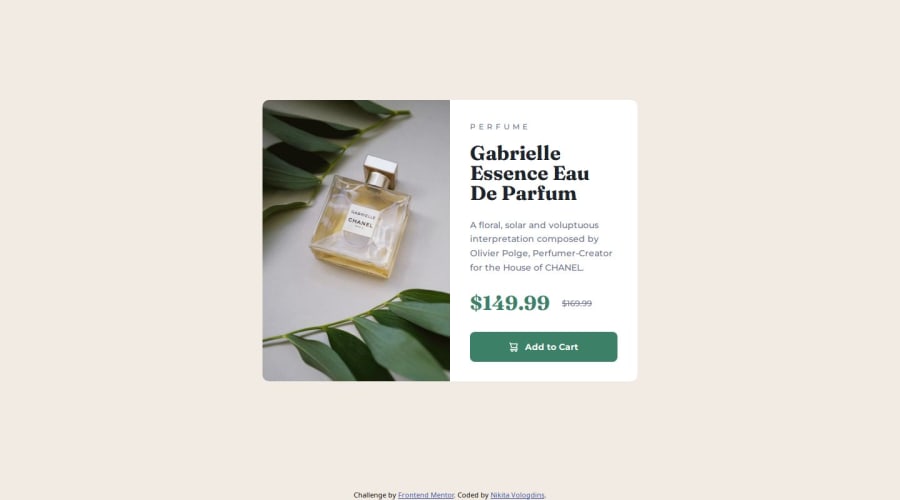
Design comparison
Community feedback
- P@StroudyPosted 7 months ago
Awesome job tackling this challenge! You’re doing amazing, and I wanted to share a couple of suggestions that might help refine your approach…
-
This text in your HTML
<em>PERFUME</em>should be in lower case, You already have the uppercase transform on this CSS. -
On your
mainconsider changing the height fromheight: 100%;tomin-height: 100%;, Using min or max is better then justheightorwidthfor a responsive website, -
Having a clear and descriptive
alttext for images is important because it helps people who use screen readers understand the content, making your site more accessible. It also improves SEO, as search engines usealttext to understand the image's context, helping your site rank better, Check this out Write helpful Alt Text to describe images,
Great job taking the time to learn! Your efforts are paying off, and I hope these insights guide you to even more success. Keep pushing forward, and remember, you’ve got this! Enjoy your coding adventures! 💪
Marked as helpful0 -
Please log in to post a comment
Log in with GitHubJoin our Discord community
Join thousands of Frontend Mentor community members taking the challenges, sharing resources, helping each other, and chatting about all things front-end!
Join our Discord
