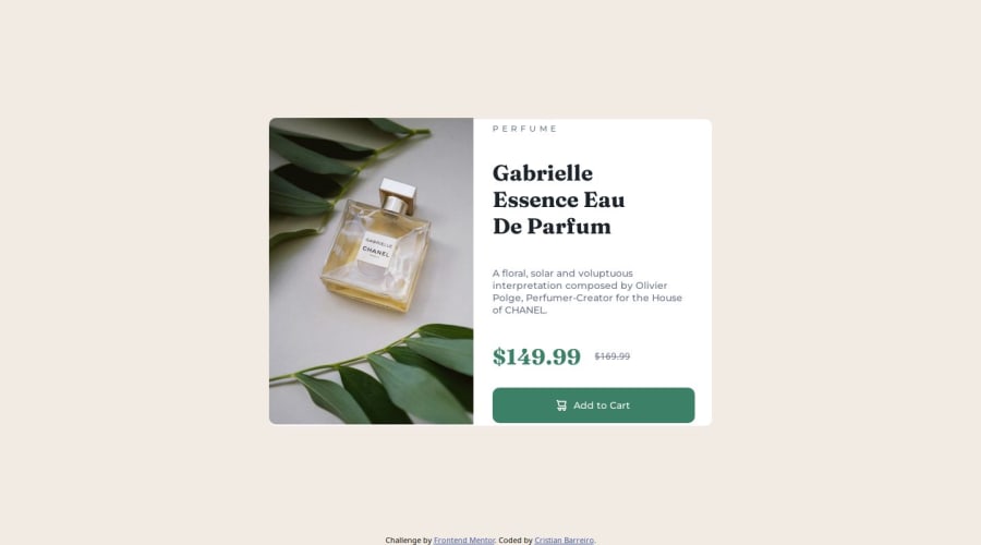


Design comparison

Solution retrospective
I'm most proud of how the project came together, particularly the seamless integration of different components and the user interface. I focused on following best practices for accessibility and responsiveness, which made the app easy to use on various devices. The backend and frontend communication is well-structured, and I was able to handle multiple data streams effectively.
Next time, I would focus more on optimizing the code for performance. While everything works as expected, I realized that some parts of the code could be made more efficient, particularly when handling larger datasets. Additionally, I'd like to improve the user authentication flow to make it more intuitive.
What challenges did you encounter, and how did you overcome them?One of the biggest challenges was managing the relationship between different models in my database. There were cases where I needed to refactor the data structure to ensure the relationships were properly normalized, which caused some initial confusion.
To overcome this, I revisited the Laravel documentation and worked through some of the database relationship examples. I also used debugging tools to monitor how data was being passed between controllers, which helped me isolate and resolve issues. Collaborating with my peers also helped me gain insights into better structuring my database and controller methods.
What specific areas of your project would you like help with?Database Optimization: I've been working with several complex relationships between models, and I feel like there may be room for optimization. I'd love feedback on how I can improve the queries to be more efficient when dealing with large amounts of data.
Authentication Flow: While my current authentication system is working, I think there's room to enhance the user experience. Any suggestions on making the authentication flow more intuitive would be greatly appreciated.
Frontend Performance: I'm aware that some of my frontend code might be a bit heavy in terms of performance. Any tips on optimizing CSS/JS or improving load times would be helpful.
Community feedback
- @MarziaJaliliPosted 9 days ago
Awesome work!
A cherry on top?
When the screen gets smaller the card starts overflowing, buddy. If you want to prevent that, you can use the media queries.
They allow your website to adapt to different devices, which surely improves your users experience. We simply set the condition in a media query and the styles are applied only when specific conditions (like screen width) are met.
Some commonly used breakpoints:
- Mobile: max-width: 599px
- Tablet: min-width: 600px and max-width: 899px
- Desktop: min-width: 900px
- Large Desktop: min-width: 1200px
A basic example of using it:
/* Default styles for mobile devices */
body {
    font-size: 1rem;
}

/* Styles for tablets */
@media (min-width: 600px) {
   /* starting from 600px and above */
    body {
        font-size: 1.2rem;
    }
}

/* Styles for desktops */
@media (min-width: 900px) {
   /* starting from 900px and above */
    body {
        font-size: 2.rem;
    }
}
And for your project, you can set the display
girdto the parent element of the card or if you already haveflexyou can change its direction tocolumnto make the two parts of the card (the image and the descriptions) appear on top of each other.Take the code below as an example:
@media (max-width: 599px) {
  .main-content {
    display: grid;
    /* or if you had flex already... */
    flex-directin: column;
   }
}
You can also use
emorremunits instead ofpxfor more flexible responsive designs.Great job finishing the project ovall, it looks outstanding!
😎😎😎
0@neouruguayancrPosted 9 days ago@MarziaJalili @media screen and (max-width: 648px) { main { display: flex; align-items: center; justify-content: center; height: 100vh; }
.product-container { width: 90%; max-width: 375px; height: 300px; margin-top: 0; position: relative; }
.product-image img { width: 200px; min-height: 100%; }
.product-details h1 { font-size: 14px; } .product-details h3 { font-size: 9px; } .product-details p { font-size: 6px; } .product-details .cart { width: 80px; height: 20px; } } thats what i improve
0

Please log in to post a comment
Log in with GitHub
Join our Discord community
Join thousands of Frontend Mentor community members taking the challenges, sharing resources, helping each other, and chatting about all things front-end!
Join our Discord