Not Found
Not Found
Not Found
Not Found
Not Found
Not Found
Not Found
Not Found
Not Found
Not Found
Not Found
Not Found
Not Found
Not Found
Not Found
Not Found
Not Found
Not Found
Not Found
Not Found

Submitted

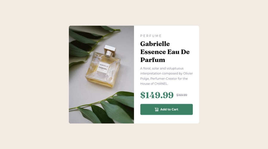
Product Preview Card Component.

@diaaFaris

Desktop design screenshot for the Product preview card component coding challenge

This is a solution for...

  • HTML
  • CSS
1newbie
View challenge

Design comparison


SolutionDesign

Solution retrospective


Happy to receive any improvements to the code or the design.

Community feedback

Lucas 👾 104,420

@correlucas

Posted

👾Hello Diaa, Congratulations on completing this challenge!

Here’s some tips to improve your solution code:

1.Save your time using a CSS RESET to remove all default settings that are annoying as the margins, paddings, decorations and optimize it making easier to work,see the article below where you can copy and paste this css code cheatsheet: https://piccalil.li/blog/a-modern-css-reset/

2.You’ve used px as the unit for sizes but the problem with pixels is that its not optimized for multiple devices and screens. So a good fit its to use rem or em that have a better performance and make your site more accessible between different screen sizes and devices. REM and EM does not just apply to font size, but to all sizes as well.

✌️ I hope this helps you and happy coding!

Marked as helpful

1

@diaaFaris

Posted

@correlucas Thank you Lucas for your advice it was so helpful and I will apply these tips in my future projects.

1
romila 3,570

@romila2003

Posted

Hi Diaa,

Congratulations 🎉 for completing this challenge, the card looks great and is responsive. There are some issues I want to address:

  1. It is best practice to wrap the main content within the main tag which would ensure that your content is wrapped within the correct landmarks e.g. <main class="container"></main>
  2. I noticed that you took a desktop-first approach however I would recommend the mobile-first approach as it easier for responsiveness and to rearrange/change the elements within your card/body. Therefore, rather using the max-width property within the media query, you can use the min-width property instead.

Overall, great attempt and wish you the best for your future projects so keep coding 👍.

Marked as helpful

1

@diaaFaris

Posted

@romila2003 This is really helpful. Thank you for your advice.

1

Please log in to post a comment

Log in with GitHub
Discord logo

Join our Discord community

Join thousands of Frontend Mentor community members taking the challenges, sharing resources, helping each other, and chatting about all things front-end!

Join our Discord