Not Found
Not Found
Not Found
Not Found
Not Found
Not Found
Not Found
Not Found
Not Found
Not Found
Not Found
Not Found
Not Found
Not Found
Not Found
Not Found
Not Found
Not Found
Not Found
Not Found

Submitted

Product preview card component

@Meowmeow11120

Desktop design screenshot for the Product preview card component coding challenge

This is a solution for...

  • HTML
  • CSS
1newbie
View challenge

Design comparison


SolutionDesign

Solution retrospective


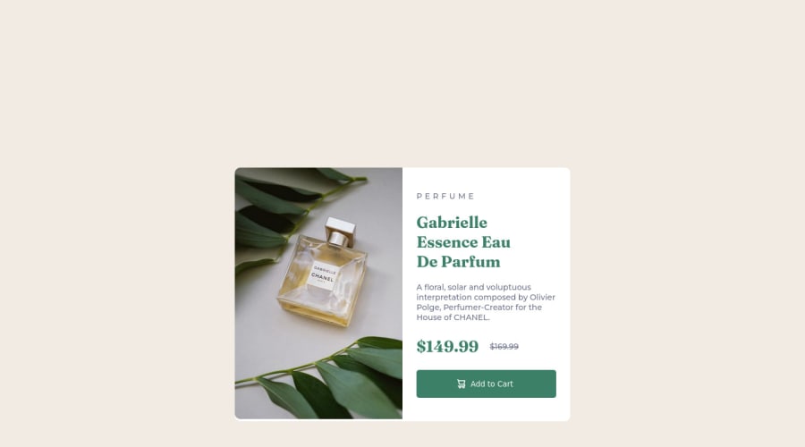
there is my first projection after I learn css and html myself for a month. There are a lot of mistakes, I would like to gain advices from everybody. In addition, I would like to ask How to make a box sized to hold images and content without having to set the width to be half the width of the box containing them.

Community feedback

@fibonacci001

Posted

hi, @Meowmeow11120 congrats on completing your tasks, about the question you asked, i have some advice for you. There are a few different ways to create a box that can hold images and content without having to set the width to be half the width of the container. Here are a few options:

  1. Use the "display: flex" property on the container element, and set the "flex-wrap" property to "wrap". This will allow the items inside the container to automatically wrap to the next line if there isn't enough horizontal space. Here's an example CSS: .container { display: flex; flex-wrap: wrap; }
  2. Use the "max-width" property instead of the "width" property on the container element. This will allow the container to shrink to the size of its contents, but won't expand beyond the maximum width specified. Here's an example CSS: .container { max-width: 800px; /* set your desired maximum width */ }
  3. Use the "inline-block" display property on the items inside the container, and set the "vertical-align" property to "top". This will allow the items to stack vertically, and the container will automatically adjust to the height of the tallest item. Here's an example CSS: .item { display: inline-block; vertical-align: top; } i hope you find them useful on your next tasks
0

@Meowmeow11120

Posted

@fibonacci001 Hi Richard, I tried way #1 and #2 already, but It still have the white background bigger than the image when I change to mobile reponsive mode. after that, I tried to set the image size in @media and it work ; the image and the text box fit the container perfectly. However, I have to set the size of the image in 2 mode( mobile and desktop), so my question is if we have another way to set the image size without setting specific size for the image. Thank you for your advices!!!!

0

Please log in to post a comment

Log in with GitHub
Discord logo

Join our Discord community

Join thousands of Frontend Mentor community members taking the challenges, sharing resources, helping each other, and chatting about all things front-end!

Join our Discord