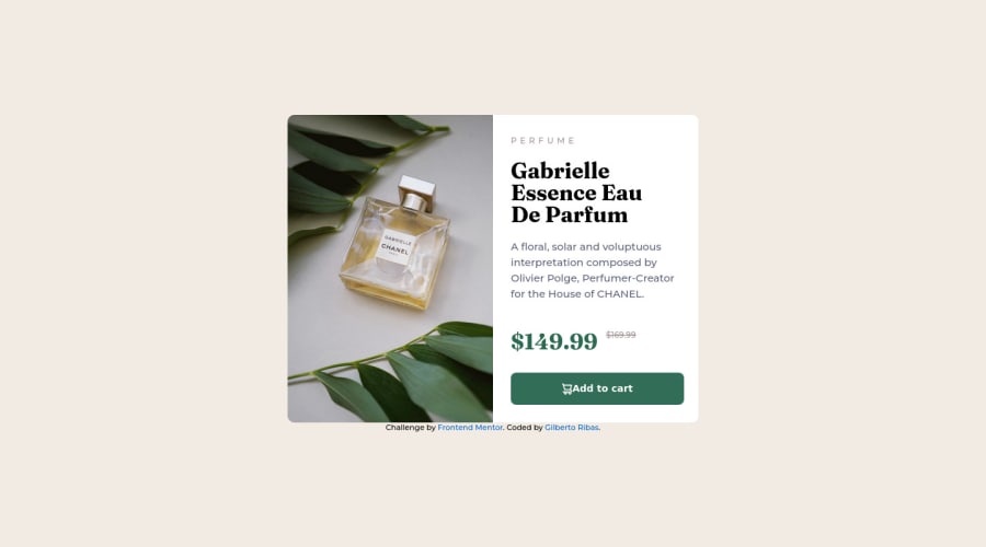
Not Found
Not Found
Not Found
Not Found
Not Found
Not Found
Not Found
Not Found
Not Found
Not Found
Not Found
Not Found
Not Found
Not Found
Not Found
Not Found
Not Found
Not Found
Not Found
Not Found

Submitted

Product preview card component just html and css

Gilberto 20

@ribasgil

Desktop design screenshot for the Product preview card component coding challenge

This is a solution for...

  • HTML
  • CSS
1newbie
View challenge

Design comparison


SolutionDesign

Solution retrospective


Hi, this is my second project all by myself. I've been studying html/css/js alone for 2 weeks now. Today I realized that I still have a long way to go, even looking at code from other devs I was not able to make mobile responsiveness work at all. It's going to be a rough road, but I won't stop now. When I have enough knowledge, I'll come back to finish the project, thank you.

Community feedback

@spencer-rafada

Posted

Hello,

I'm happy you got to this point on the project despite having 2 weeks of knowledge only. I suggest to keep practicing the challenges here in FEM and they will help you a lot. Also, don't be afraid to google search, but don't google search the solution. Google search the process that you want to achieve and try to implement it on the problem.

I use @media queries to set conditions for interactiveness when I am designing for mobile. Here is a great resource about media queries: https://developer.mozilla.org/en-US/docs/Web/CSS/Media_Queries/Using_media_queries.

I hope this helps and keep working hard!

Marked as helpful

1

Gilberto 20

@ribasgil

Posted

@spencer-rafada Thanks for the feedback, I will definitely study the link you left.

0
Elias Lind 130

@EL132

Posted

Hello!

I'm happy to see you got this far on the project! I know you said you would come back to this project, but I figured I would leave a comment to help you get there sooner/easier (hopefully). I recently also learned responsive design and successfully implemented it using @media queries. A media query is a way that lets your webpage respond to certain conditions. When I am designing for my mobile designs, I use the following syntax:

@media (max-width: 1380px) { .wrapper { width: 400px; } }

This is an example of my page needing to do something different when the width of the page goes below 1380 pixels. You can think of it like "Once my page goes below 1380px in width, apply the properties inside the curly braces {}" Hopefully, this example is enough to get you started; this technique can be used for a lot of topics and is a great place to start.

An alternative method is a CSS library called Bootstrap; personally, I do not like Bootstrap, but many do like if because it makes resizing websites very easy. Here is a link to the bootstrap documentation for its responsive grid design: https://getbootstrap.com/docs/4.0/layout/grid/

I hope this helps! Elias

Marked as helpful

1

Gilberto 20

@ribasgil

Posted

@EL132 Hello Elias, I understood the example and I swear I tried to do it this way when I was in the project, but I couldn't make it responsive. Anyway, I'll study about media query and take a look at bootstrap. thanks for the feedback.

0

Please log in to post a comment

Log in with GitHub
Discord logo

Join our Discord community

Join thousands of Frontend Mentor community members taking the challenges, sharing resources, helping each other, and chatting about all things front-end!

Join our Discord