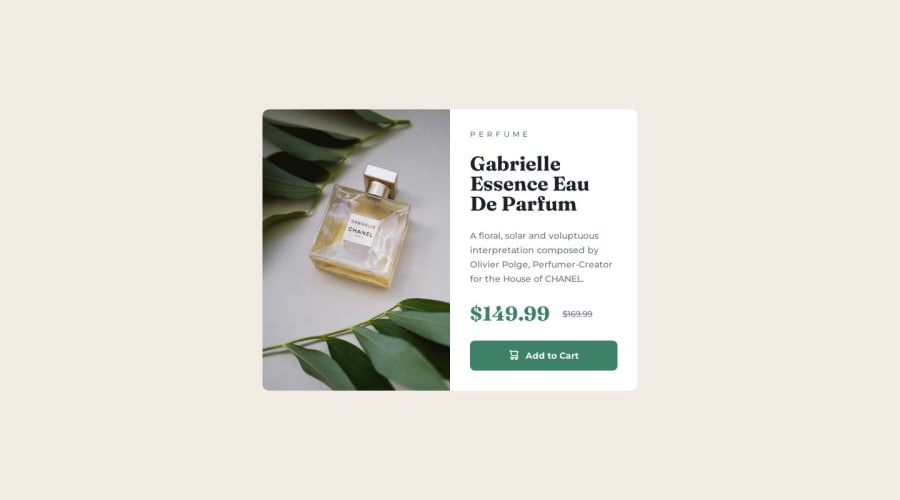
Design comparison
Solution retrospective
I've just completed my fourth front-end coding challenge via Frontend Mentor š
I wanted to make sure and focus on responsiveness for this card component to ensure a proper range for screen adaption. Will continue to focus and study this for future projects (it's essential!) :)
Any and all feedback is welcome :)
Community feedback
- @danielmrz-devPosted 10 months ago
Hello Vanessa!
Your solution looks great!
I have a couple of suggestions for improvement:
- In order to make your HTML code more semantic, and since that is the main title of the screen, replace the
<h2>
with<h1>
. I also noticed that you used ah6
before ah2
. Unlike what most people think, their difference is not just about the size and weight of the text.
The
<h1>
to<h6>
tags are used to define HTML headings.<h1>
defines the most important heading.<h6>
defines the least important heading. Only use one<h1>
per page - this should represent the main heading/subject for the whole page. Also, do not skip heading levels - start with<h1>
, then use<h2>
, and so on.- Also, still about semantic HTML, replace your
div.container
withmain.container
.
All these tag changes may have little or no visual impact but they make your HTML code more semantic and improve SEO optimization as well as the accessibility of your project.
I hope it helps!
Other than that, great job!
Marked as helpful2@vanessa-ayerPosted 10 months agoThis is very helpful @danielmrz-dev! Thank you for explaining with much detail. Improving SEO optimization and accessibility is important - thank you for sharing the recommended usage for HTML headings. Will make some updates!
1 - In order to make your HTML code more semantic, and since that is the main title of the screen, replace the
- @BlackpachamamePosted 10 months ago
Greetings! you have done a great job š
š Some accessibility and semantics recommendations for your HTML
- To improve the semantics of your HTML, you can change your
<div class="container">
to a<main class="container">
- I can only mention an accessibility issue, you can add a short description to your image with the
alt
attribute. In case it is just a decorative image, such as an icon or logo, you can leave it empty:alt=""
. More info - You can use the
picture
tag to change the image according to the screen size, instead of one the same image for both cases. More info
Marked as helpful1 - To improve the semantics of your HTML, you can change your
- @Jojo-onedevPosted 10 months ago
I like it š
1
Please log in to post a comment
Log in with GitHubJoin our Discord community
Join thousands of Frontend Mentor community members taking the challenges, sharing resources, helping each other, and chatting about all things front-end!
Join our Discord