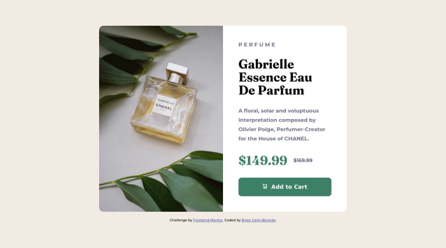
Responsive Product Preview Card Component using flexbox and CSS
Design comparison
Solution retrospective
Please let me know what I could improve on my code?
Happy to hear any feedback in general :D
Community feedback
- @CodeWithAlaminPosted almost 2 years ago
Hi Brian Carlo Birondo👋 Great job on completing this challenge! 🥳
I would like to share a few suggestions on this solution if you don't mind.
-
One thing that could be improved is the use of CSS variables. Instead of hardcoding colors throughout the stylesheet, you could define them as variables at the beginning of the stylesheet and then use the variables consistently throughout the stylesheet. For example, instead of using
hsla(212, 21%, 14%, 0.5)
for the product and product-desc styles, you could define a variable called--very-dark-blue
at the beginning of the stylesheet and usevar(--very-dark-blue)
for the product and product-desc styles. This would make it easier to maintain and update the color scheme of the website. -
Another improvement that could be made is the use of semantic HTML elements. Currently, the product name and description are both styled as
<p>
elements, which is semantically correct for text content. However, the title of the product is styled as a<h1>
element, which is generally reserved for the main heading of a page. Instead of using a<h1>
element, it might be more semantically appropriate to use a<h2>
or<h3>
element for the product title. This would give more context to the structure of the page and make it easier for screen readers and other assistive technologies to interpret the content. -
One final suggestion for improvement is the use of responsive design techniques. Currently, the page has a fixed width of
var(--container-width)
, which is set to80rem
. This means that the page will always take up the same amount of space on the screen, regardless of the size of the viewport. Instead of using a fixed width, it would be more user-friendly to use a responsive layout that adjusts to the size of the viewport. This could be achieved using CSS grid or flexbox layouts, as well as media queries that adjust the layout and styles for different screen sizes. This would allow the page to be easily viewed on a wide range of devices, from desktop computers to smartphones.
Overall, this is a very well done solution to the challenge. Great job!
I hope this feedback was helpful. 😊 Keep up the good work!👍
Marked as helpful0@Briancarlo24Posted almost 2 years ago@CodePapa360 I'm really loving this feedbacks that I'm getting. Awesome tips you have there. Will make sure to keep this in mind. Thank you very much!
By the way I have a question in case you are a pro user. Do you think it's worth it to get the pro version so that I can have a figma file? I feel like it will help a lot to know the font size and dimensions.
0@CodeWithAlaminPosted almost 2 years ago@Briancarlo24 It can be helpful to have access to a Figma file when working on a design challenge, as it can provide you with more detailed information about the layout, dimensions, and styles of the design. With the pro version of Frontend Mentor, you can access the Figma file for each challenge, which can be especially useful if you are trying to recreate the design as closely as possible.
However, it's ultimately up to you to decide whether the pro version is worth it for your own learning and development needs. If you feel that having access to the Figma file would be beneficial to your understanding of the challenge and your ability to recreate the design, then it might be worth considering getting the pro version. On the other hand, if you feel confident in your ability to understand and recreate the design without the Figma file, then you may not need to upgrade.
Ultimately, the decision to get the pro version is a personal one that depends on your own goals and needs. If you are still unsure, you might consider trying out the free version of Frontend Mentor and seeing how it meets your learning and development needs before deciding whether to upgrade to the pro version.
0 -
- @Pawel1894Posted almost 2 years ago
Hey! Great job finishing this challenge.
Here is some feedback from me
-
It is important for search engines to keep correct html syntax. You should put your section inside
<main></main>
tags and footer inside<footer></footer>
tags -
To get image looking simillar to frontend mentor design i would recommend you changing it to background-image instead of
<picture>
. Then instead of usingflex
just usegrid
and make it 2 columns od desktop resolutions, it will automatically adjust image size to height of content on the right side. -
Give it lower max-width so it won't be that big, and work a bit on font-sizes and bigger spaces between elements.
If you need some help you can always dm me on discord Paaaweł#7660 or lookup my solution for this project I think it is very close to design.
Marked as helpful0@Briancarlo24Posted almost 2 years ago@Pawel1894 Wow that's so helpful. I will keep this in mind moving forward. Thanks!
1 -
Please log in to post a comment
Log in with GitHubJoin our Discord community
Join thousands of Frontend Mentor community members taking the challenges, sharing resources, helping each other, and chatting about all things front-end!
Join our Discord