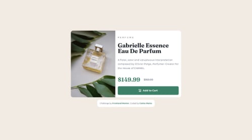
Design comparison
Solution retrospective
I've successfully styled my project using SASS/SCSS, though it was a challenging first experience. After extensive research, I believe I did a decent job. I plan to continue using it in future projects to become more proficient.
What challenges did you encounter, and how did you overcome them?Since it was my first time using SASS, getting used to the syntax and multiple files, as well as the nesting it was challenging to say the least. I think i did a good job in the end after a lot of research on it about the common practices.
What specific areas of your project would you like help with?Please focus on the SASS/SCSS, if possible, what i did wrong or what can i improve on for the next time. thank you so much for your feedback.
Community feedback
- @huyphan2210Posted about 2 months ago
Hi, @carlosmarte23
I took a look at your solution and I have some suggestions:
- Your card isn't centered, and it looks like the
body
has amargin
at the top, which is causing the page to be scrollable on desktop viewports (likely unintended). I recommend using Flexbox or CSS Grid on thebody
to center the card (you can look up how to do this), and removing themargin: 2rem auto
from your.product-card
. Thismargin
is creating extra space at the top of the page, but ideally, we want thebody
to cover the full viewport without extra space. - Use
min-height: 100vh
instead ofheight: 100vh
in thebody
. The reason for this is thatheight: 100vh
sets a strict height, which may cause issues on some devices or when the content exceeds the viewport height (e.g., on mobile devices with dynamic toolbars). By usingmin-height: 100vh
, you're ensuring that thebody
is at least the height of the viewport, but it can expand if the content grows beyond that.
Hope this helps!
Marked as helpful1@carlosmarte23Posted about 2 months agoThanks for the feedback. Since I was so focused on using scss I think I forgot I the basics and didn't follow the design 100 percent. I'll update the code with your feedback. Thank you!! @huyphan2210
1 - Your card isn't centered, and it looks like the
- @Untest57Posted about 2 months ago
Hello Carlos Marte. I applaud your challenge. I was impressed by the increase in responsiveness on mobile.
I would like to share some opinions.
-
There is something different from the design provided in the challenge.
The size ratio of images and text does not match in Desktop.
1@carlosmarte23Posted about 2 months agoThanks for the feedback. I'll try to update the code to follow the design more closely. Thank you again! @Untest57
1 -
Please log in to post a comment
Log in with GitHubJoin our Discord community
Join thousands of Frontend Mentor community members taking the challenges, sharing resources, helping each other, and chatting about all things front-end!
Join our Discord