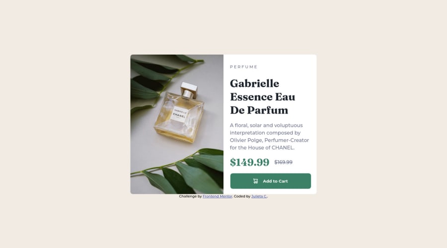
Design comparison
Solution retrospective
Any feedback are welcome
Community feedback
- @Mr-jawPosted almost 2 years ago
Hi there 👋
You have done a great job by using CSS custom properties and relative units
For the
altattribute in the<img>tag use more descriptive text (i.ealt="Chanel perfume") rather than saying 'product', being more specific on what the product is like and more accessible.avoid using hyphens or underscore in the
altattribute since, it must humanly readable and understandableI hope this was useful 😊
KEEP GRINDING
Marked as helpful0 - @AlonGitHPosted almost 2 years ago
Nice work Julieta! Please note to change button background once hovering ;-) Plus change cursor to pointer.
Kind Regards
1 - @link4mediaPosted almost 2 years ago
Thank you very much, you are absolutely right, basic error :( I will correct it and update.
0
Please log in to post a comment
Log in with GitHubJoin our Discord community
Join thousands of Frontend Mentor community members taking the challenges, sharing resources, helping each other, and chatting about all things front-end!
Join our Discord
