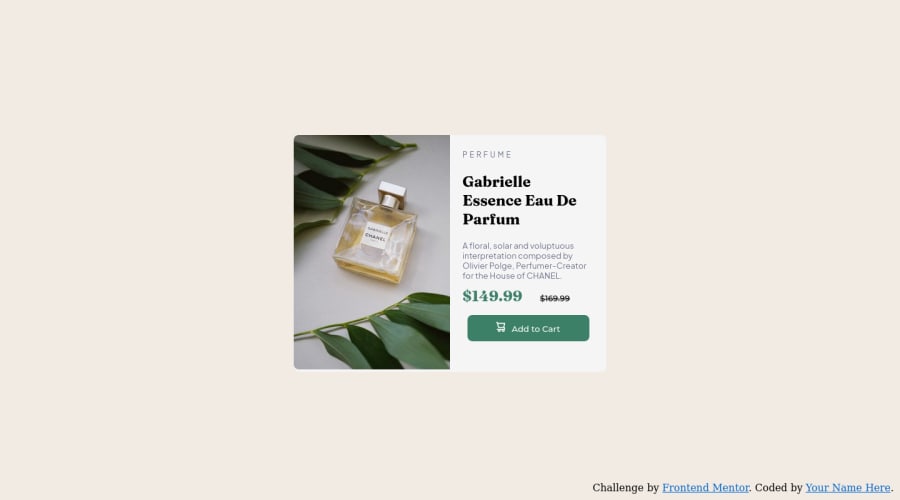
Product Preview Card Component - HTML/CSS Desktop/Mobile Challenge


Design comparison

Solution retrospective
Process:
- Divided the screen into 2 sides, .containLeft and .containRight. Held together by .allcontain > .container. .containLeft and .containRight were given "flex: 1"; to put them side-by-side.
- .containLeft holds the images
- .containRight holds the h1, article, and .push button
Questions:
- The .containLeft image for the Desktop version does not completely cover the div that it's in. Margin, Border, and Padding (should be) at 0. How do I get the image to completely fill its div so that there is no white space below it?
BIG QUESTION:
- Mobile block stacking. I understand how @media-screen works with changing the pictures between the Desktop and Mobile image since they are two separate images, but how do I proceed in a way that allows all the blocks to stack on top of each other without messing everything up in Desktop view? Currently, nothing in the code has been done to make a mobile version in order to preserve the current Desktop version.
Community feedback
- @gautamjuyalPosted about 2 years ago
Hi Jordan. Congratulations on completing the challenge. Regarding your major question, I understand you want to ask how can you change the layout of the component for mobile view. One way to achieve that would be using flexbox and media queries. Flexbox has flex-direction property and that in my opinion is best suited for this scenario. For desktop view, set flex-direction to row(default) and for mobile view, set it to column.
.component{ display:flex; flex-direction: row; }@media (max-width: (400px)) //mobile widht { flex-direction: column; }Hope it helps.
Marked as helpful1@littledragonshrimpPosted about 2 years ago@gautamjuyal Thank you. I'll attempt to do this in a new index file to preserve this current rendition and see how it goes.
1 - @correlucasPosted about 2 years ago
👾Hello @littledragonshrimp, Congratulations on completing this challenge!
Your solution its almost done and I’ve some tips to help you to improve it:
You did a good work putting everything together in this challenge, something you can do to improve the image that needs to change between mobile and desktop is to use
<picture>instead of<img>wrapped in a div. You can manage both images inside the<picture>tag and use the html to code to set when the images should change setting the devicemax-widthdepending of the device (phone / computer) Here’s a guide about how to usepicture:https://www.w3schools.com/tags/tag_picture.aspSee the example below:
<picture>
  <source media="(max-width:650px)" srcset="./images/image-product-mobile.jpg">
  <img src="./images/image-product-desktop.jpg" alt="Gabrielle Parfum" style="width:auto;">
</picture>
✌️ I hope this helps you and happy coding!
0 - @AdrianoEscarabotePosted about 2 years ago
Hi Jordan, how are you?
I really liked the result of your project, but I have some tips that I think you will like:
1- Every page should have one main landmark
<main>. So replace the div that wraps the whole content with<main>to improve the accessibility. click here2- All page content should be contained by landmarks, you can understand better by clicking here: click here
We have to make sure that all content is contained in a reference region, designated with HTML5 reference elements or ARIA reference regions.
Example:
native HTML5 reference elements:
<body>
    <header>This is the header</header>
    <nav>This is the nav</nav>
    <main>This is the main</main>
    <footer>This is the footer</footer>
</body>
ARIA best practices call for using native HTML5 reference elements instead of ARIA functions whenever possible, but the markup in the following example works:
<body>
     <div role="banner">This is the header</div>
     <div role="navigation">This is the nav</div>
     <div role="main">This is the main</div>
     <div role="contentinfo">This is the footer</div>
</body>
It is a best practice to contain all content, except skip links, in distinct regions such as header, navigation, main, and footer.
Link to read more about: click here
2- Why it Matters
Navigating the web page is far simpler for screen reader users if all of the content splits between one or more high-level sections. Content outside of these sections is difficult to find, and its purpose may be unclear.
HTML has historically lacked some key semantic markers, such as the ability to designate sections of the page as the header, navigation, main content, and footer. Using both HTML5 elements and ARIA landmarks in the same element is considered a best practice, but the future will favor HTML regions as browser support increases.
Rule Description
It is a best practice to ensure that there is only one main landmark to navigate to the primary content of the page and that if the page contains iframe elements, each should either contain no landmarks, or just a single landmark.
Link to read more about: click here
Prefer to use
removerpxto have your page working better across browsers and resizing the elements properlyThe rest is great!!
Hope it helps...👍
0


Please log in to post a comment
Log in with GitHub
Join our Discord community
Join thousands of Frontend Mentor community members taking the challenges, sharing resources, helping each other, and chatting about all things front-end!
Join our Discord