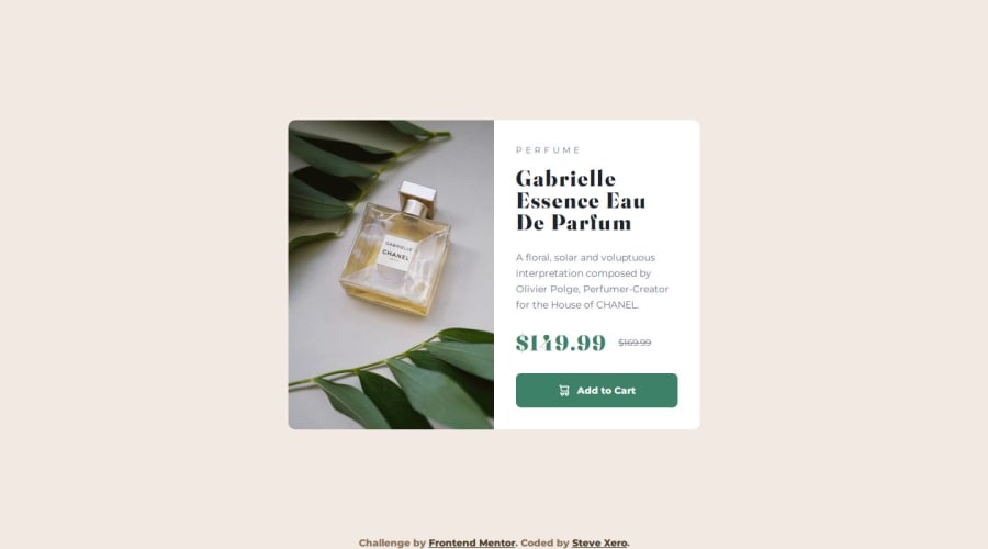
Product Preview Card Component - HTML, LESS, BEM


Design comparison

Solution retrospective
I am most proud of beginning to develop a sense of how to structure and manage my build process. The last several projects have really opened me up to accepting feedback from the community and learning where I may need improvement.
What challenges did you encounter, and how did you overcome them?In this project, I was learning Less, which was less intuitive as Sass while at the same time being more minimal and closer to vanilla CSS. I went back and forth through the docs while implementing what I'd learned and refactoring.
What specific areas of your project would you like help with?If anyone has any feedback on my Less implementation, I'd be appreciative!
Please log in to post a comment
Log in with GitHubCommunity feedback
- @0xabdulkhaliq
Hello there 👋. Congratulations on successfully completing the challenge! 🎉
- I have a suggestion regarding your code that I believe will be of great interest to you.
PiCTURE TAG 📸:
- Looks like you're currently using media queries for swapping different version of
image,
@media (min-width: 38em) {
  .product-card__image-wrapper-mobile {
    display: none;
  }
}

@media (min-width: 38em) {
  .product-card__image-wrapper-desktop {
    height: 100%;
    display: block;
  }
}
- So let me introduce the
pictureelement., The<picture>tag is commonly used for responsive images, where different image sources are provided for different screen sizes and devices, and for art direction, where different images are used for different contexts or layouts.
- Example:
<picture>
  <source media="(max-width: 768px)" srcset="small-image.jpg">
  <source media="(min-width: 769px)" srcset="large-image.jpg">
  <img src="fallback-image.jpg" alt="Example image">
</picture>
- In this example, the
<picture>tag contains three child elements: two<source>elements and an<img>element. The<source>elements specifies different image sources and the conditions under which they should be used.
- Using this approach allows you to provide different images for different screen sizes without relying on CSS, and it also helps to improve page load times by reducing the size of the images that are served to the user
- If you have any questions or need further clarification, you can always check out
my submissionand/or feel free to reach out to me.
.
I hope you find this helpful 😄 Above all, the solution you submitted is great !
Happy coding!
Marked as helpful - @Mirjax2000
can you put on the scale sass and less and tell what is better? Also another preprocesor is stylus. Will you gona try it?
Myaby in couple years, we dont need any preprocesors at all, all best funkctions are alredy in css: variables, nesting, and many more will come.
Marked as helpful


Join our Discord community
Join thousands of Frontend Mentor community members taking the challenges, sharing resources, helping each other, and chatting about all things front-end!
Join our Discord